Light & Bright Hallway Wallpaper
Many hallways tend to be dark spaces. The rooms have all the windows, which leaves the hallways a place that can feel dark and moody. Using a dark paint or dark wallpaper is usually the first thing to avoid in your hallway if it has a tendency to be pretty dim. Adding anything dark can make it feel claustrophobic. So when thinking of wallpaper for your hallway, be sure to go with something light and bright. It can add a whole new dimension to your home.
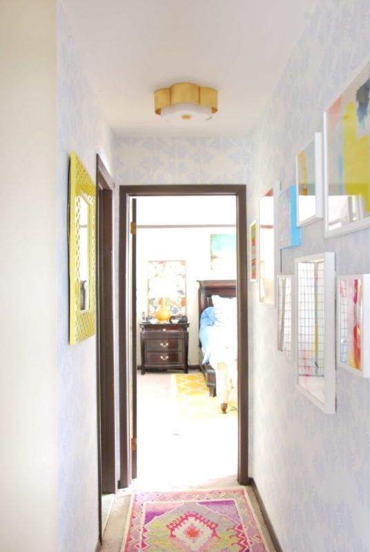
The image below shows the hallway of Camila Pavone. She used the Sarah Annie wallpaper which helped brighten the space and provide a bit of visual interest behind her wall art without competing with it.
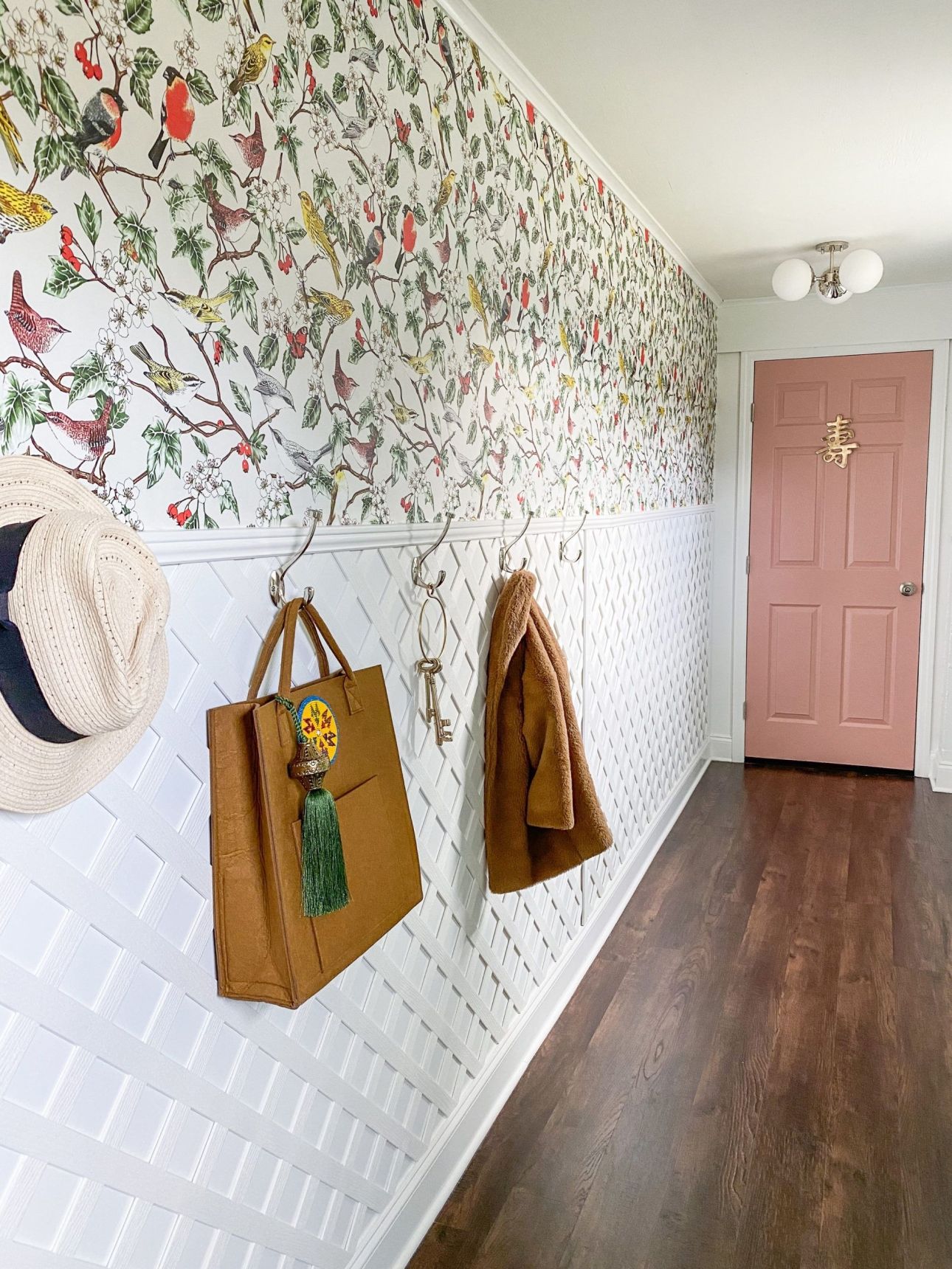
Jenna from Rain On A Tin Roof blog refreshed her mudroom and hallway with the Hawthorn design. This is a bright bird wallpaper with pops of green and red that brings plenty of light and color to the hallway. In addition to wallpaper in the hallway, the installation of the lattice on the bottom portion of the wall really gives it that country cottage vibe.
Bold Hallway Wallpaper
Another interesting aspect of your hallway is that it doesn’t necessarily have to connect with any particular theme. Much like powder rooms, hallways are a great chance to do something unique and bold. Even if your bedroom has the scandi minimalist look, your hallway can be the extroverted friend who is plenty of fun in small doses, usually when accompanied with a cocktail. After all, you’re just passing through. So make your hallway a fun experience by going bold with your wallpaper design.
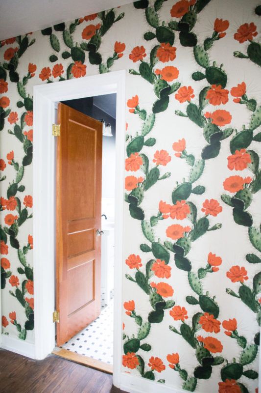
Pictured below is the hallway of Miranda Anderson Live Free Miranda. She went bold with the Cactus design.
Geometric Hallway wallpaper
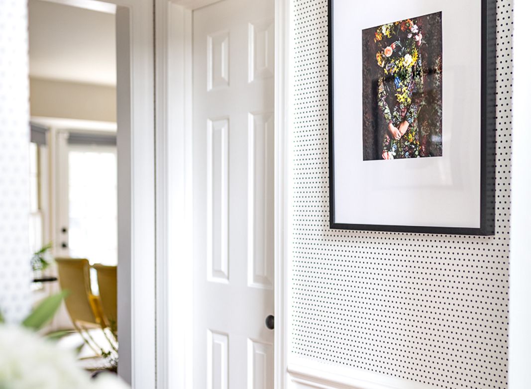
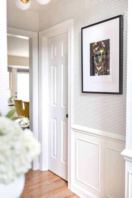
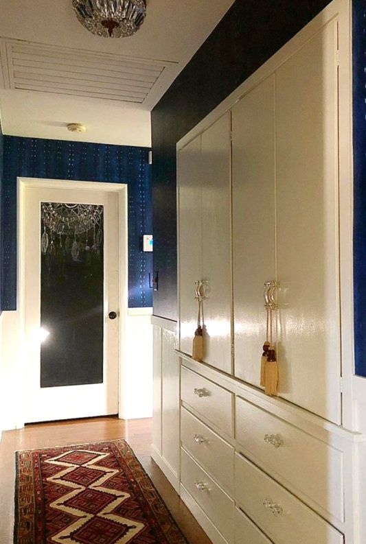
You can enhance the perception of height and depth by going with something a bit geometric. Make a hallway feel longer or taller by going with a simple stripe design. And if you want to affect perception and achieve all of the above, go with a geometric design that is both bright and bold. Here, Jewel Marlowe of Jeweled Interiors uses the Simplemente Puntos design.
Finally, not all hallways are created equal. Some are the types of dark spaces that feel enclosed with rooms off to the sides. Other hallways are bordered by only one wall with a rail or a window off to one side. In an environment, where more light and space are factors, you don’t have to shy away from using a dark wallpaper. Geometric wallpapers may even look a bit odd when they are only on one side. In these situations, a visual texture can make a beautiful addition to your decor. However, if your hallway is more exposed to the rest of the home, sticking with your overall theme may be much more important.
In the image below, Shavonda Gardner used the City Scape design just above the chair rail which keeps the dark blue wallpaper from making the hallway too dark. With white above and below the hallway wallpaper, it creates an interesting space with gorgeous contrast.
To shop for wallpaper that will turn your hallway into a walk down Lovely Lane, click here.
