This is a reblog from Making It Lovely, a One Room Challenge by designer, Nicole Balch
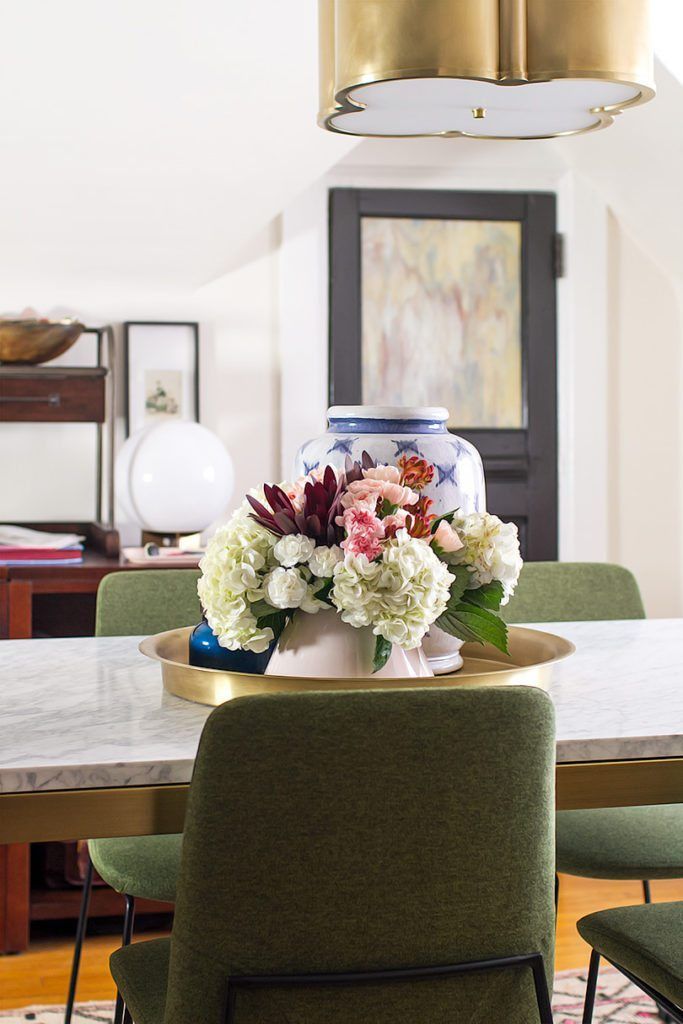
Nicole says she “wallpapered my heart out” as well as overthought her room layout and furniture choices. She arranged grocery store florals, as she expected that the florist she wanted would conveniently and unexpectedly be closed. She was ready to finally reveal her One Room Challenge.
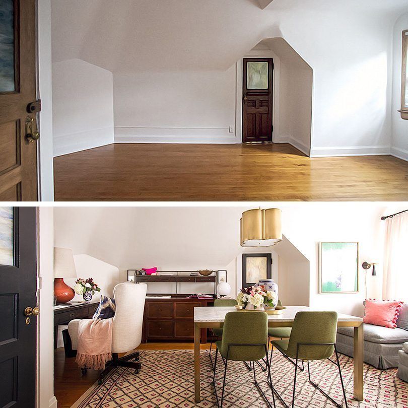
Nicole works from home on the Making It Lovely blog, and she wanted a nice office where she could have her own space. She designs for so many diferent people that she had yet to actually do some interior designing for herself, especially since she has the space to do something really great.
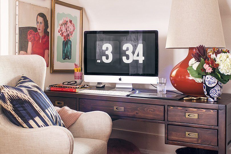
She began with the desk where she sat to write her blog and took a photo of that exact moment.
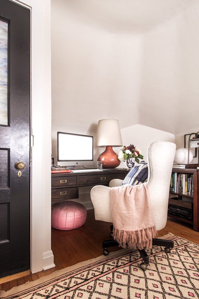
Nicole sits in that chair at her desk to write her blog. She keeps a blanket draped over the arm of the chair in case she gets cold. The pillow is mainly there for posture.
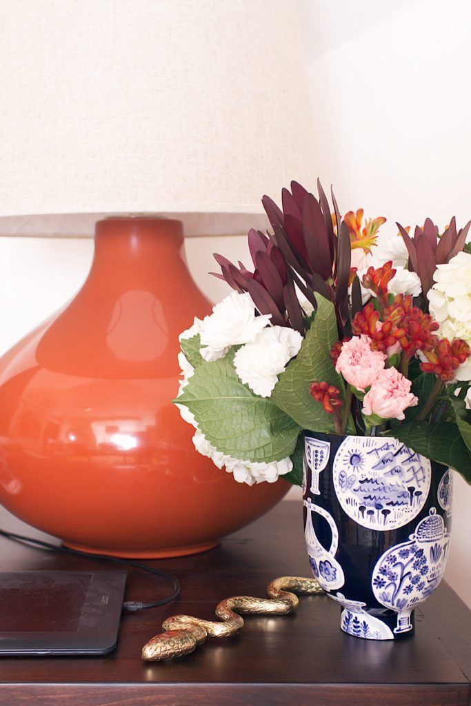
This desk is 5′ wide, giving her plenty of space for a full-sized keyboard and her Wacom tablet. She used a tablet for art many years ago, but now uses it daily. Using tablet instead of a mouse has helped her with some nagging wrist issues.
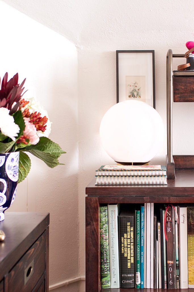
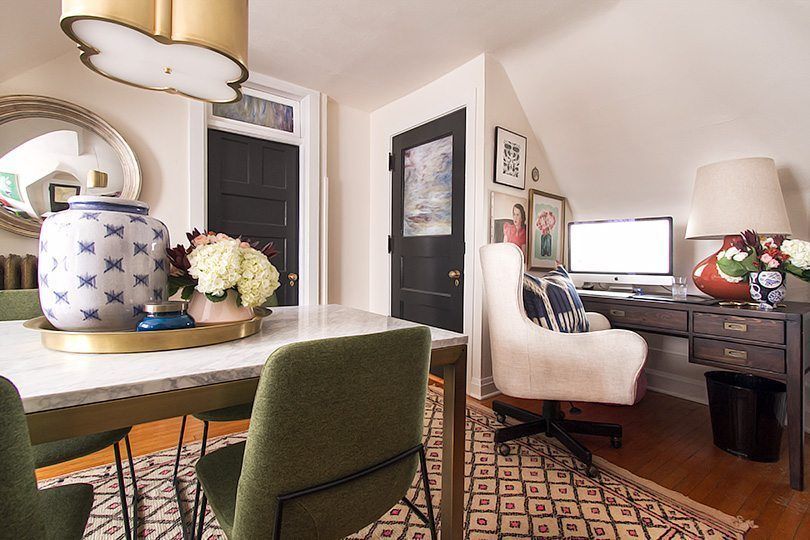
Nicole felt that the oversized ceramic lamp was a risk because she had a sloped ceiling. But thanks to 3D rendering to scale it all worked out. It balances the desk with the large monitor. The vase offers something a little reverential and whimsical, and the brass snake is awesome. She likes to keep a pink leather pouf under the desk for when she wants to prop her feet up.
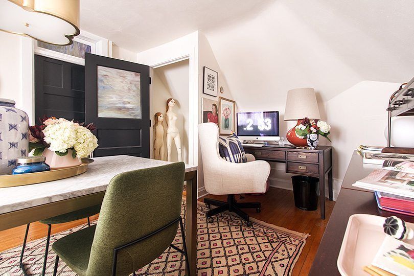
Nicole took various photos with doors open and closed as she wasn’t sure which provide for the best photographs. Just outside the door to the stairway, you can see her vintage mannequins.
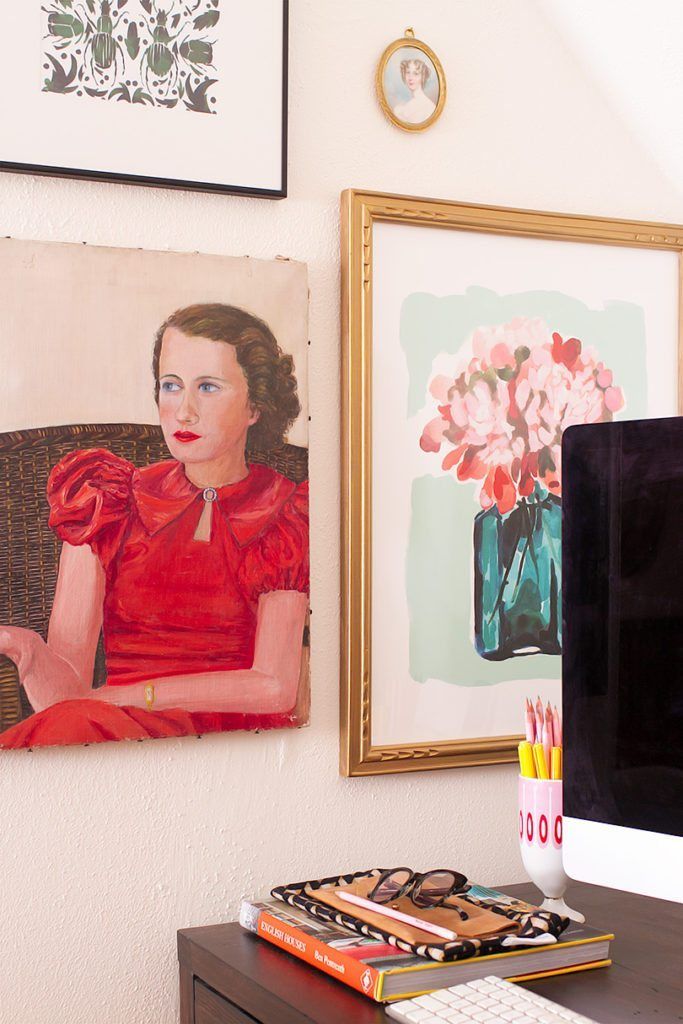
A few prints and paintings can bee seen on the angled wall on the left side of the desk. Nicole loves the Beetles print and chose it specifically for this room. The vintage portrait is from the 1930’s and taken from the library room in the house.
Her computer desk has five drawers, which are lined with wallpaper scraps that match the room’s closet. To the right of the desk is a long, low storage unit made of modular craft room furniture that holds the printer, trade catalogs, wallpaper samples, and other items.
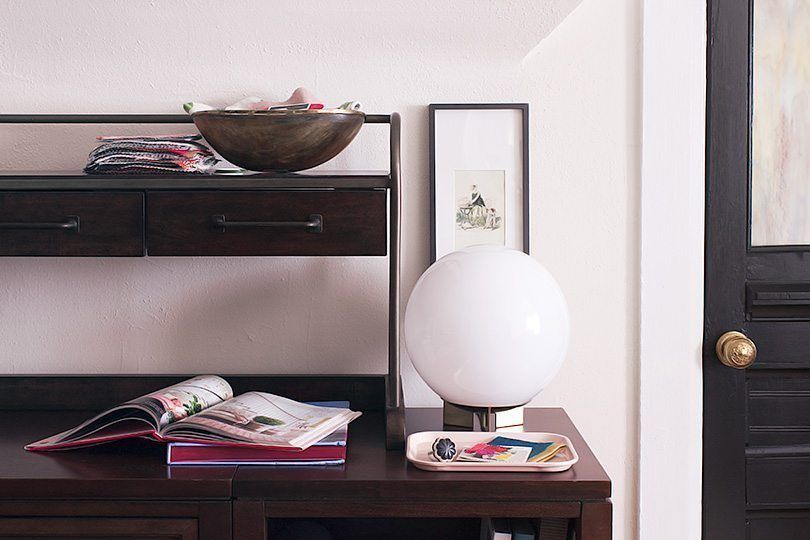
The shallow drawers in the hutch are good for personal and client design work — paint swatches, fabric and wallpaper options, that sort of thing lay on top. She figures it won’t be as neat when juggling more than four projects at a single time, but she also has the shelf area above the drawers and the surface to use as well.
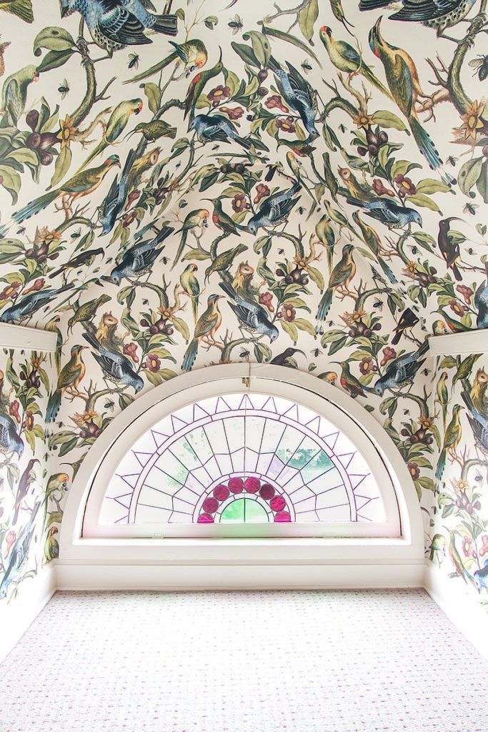
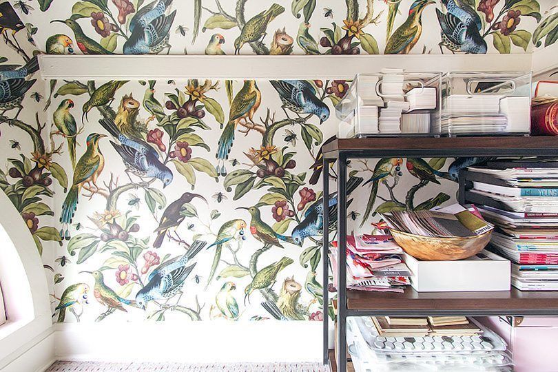
There is more storage space in the closet, what Nicole likes to call “The Rainbow Room.”
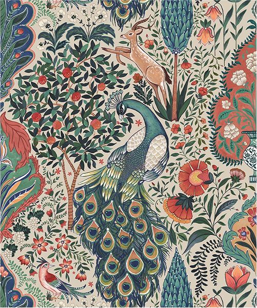
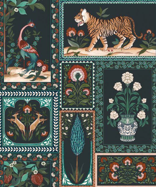
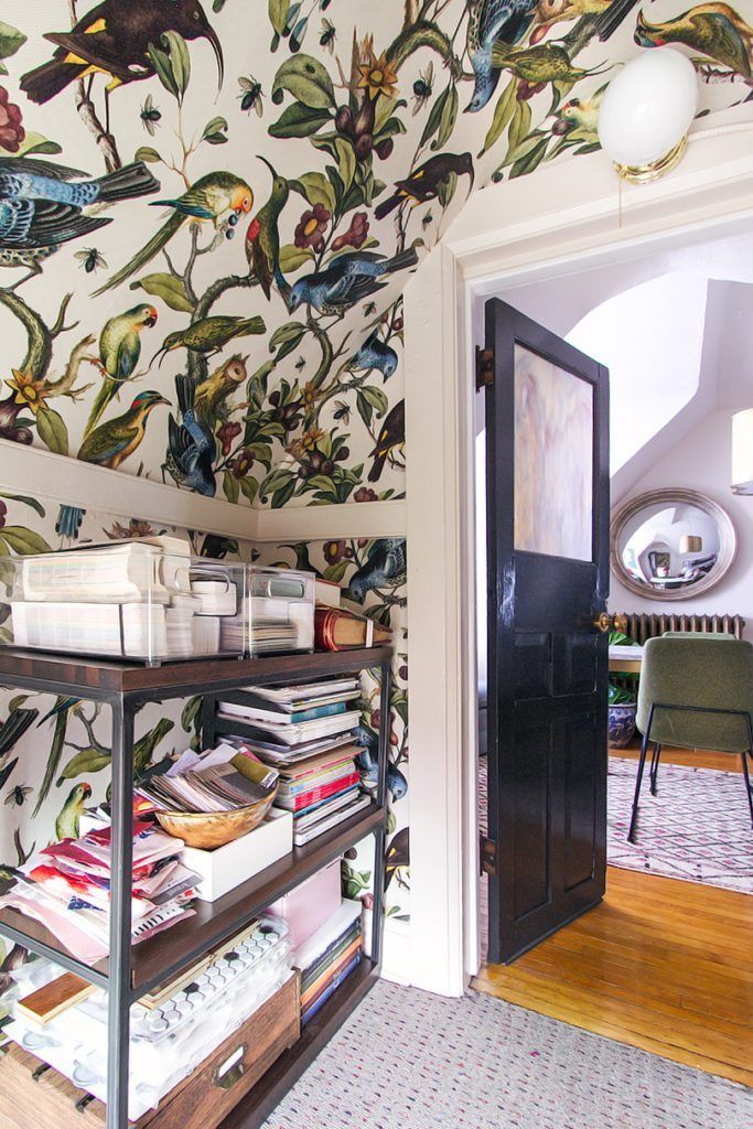
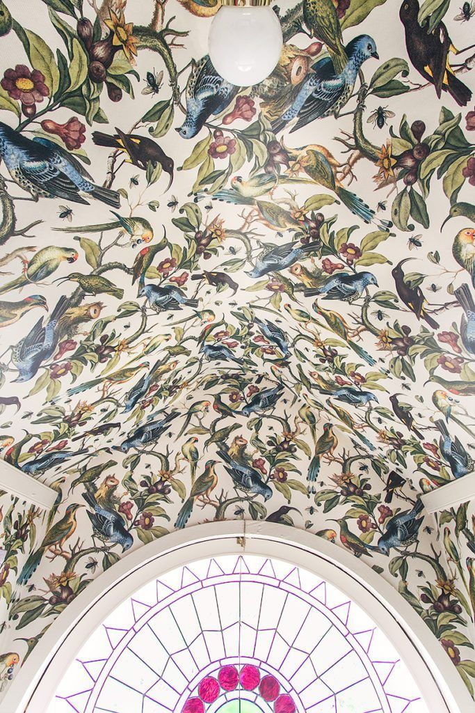
A commenter in a previous One Room Challange update suggested naming it The Aviary. She liked the idea but it was a quick ‘no’ from the kids. So, The Rainbow Room, it is. She is thinking of getting some sheepskin or floor pillows for little ones. The kids want to play and hang out in there, and we can see why. It’s a special little space even though it’s technically just a closet. But with the addition of the wallpaper called Orinthology by Milton & King, this room is simply magical.
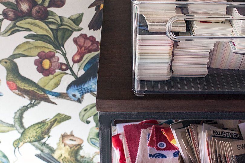
These walnut shelves, are lovely and sturdy, and filling with fabric swatches, paint fan decks, equipment, and a nice stack books, magazines, and newspaper articles Nicole has been in over the years.
Nicole replaced the bare socket above the door with an inexpensive light with a pull chain, and used a white globe to replace the ribbed glass shade that came with the base.
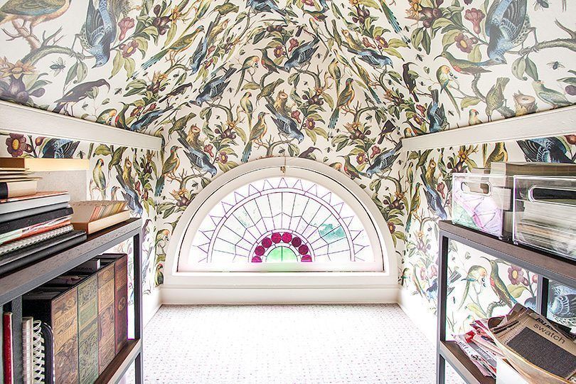
Nicole did a decoupage technique where the two halves of the wallpaper met in the center. She ended up trimming around birds and leaves, overlapping the different sides so that the pattern blended together.
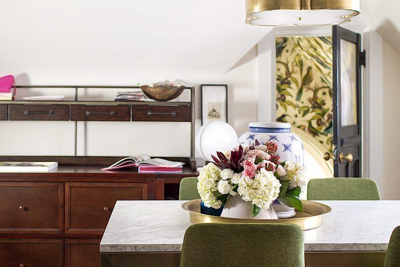
Nicole loves how the wallpaper peeks out when the door is open.
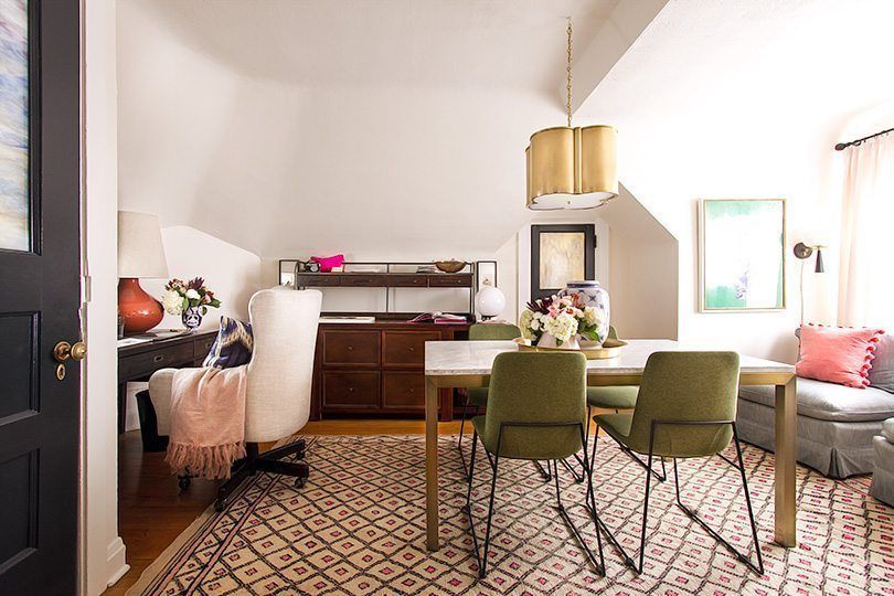
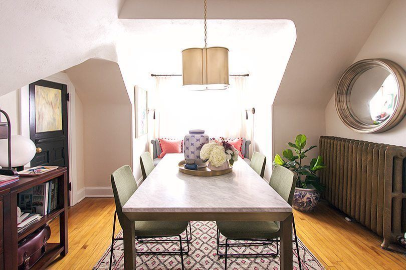
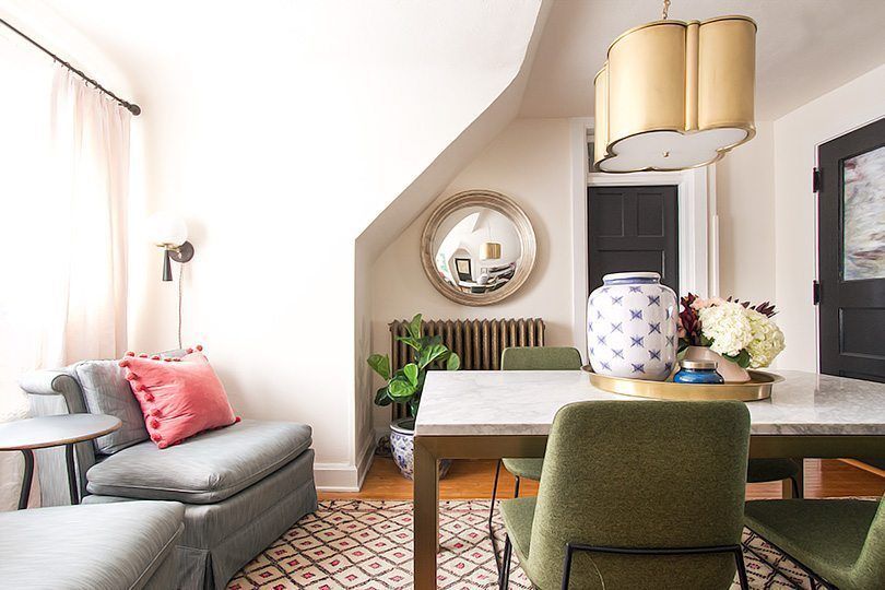
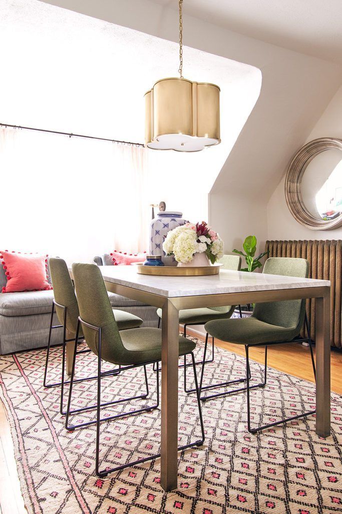
Nicole fortunately had access to new and vintage rugs from several sponsors but she already had several she had been waiting to use. She considered going with a subtle pink wool, but changed her mind and went with a rug she carried back in her luggage from Morocco. Not only does it have memories attached to it but it was the best fit.
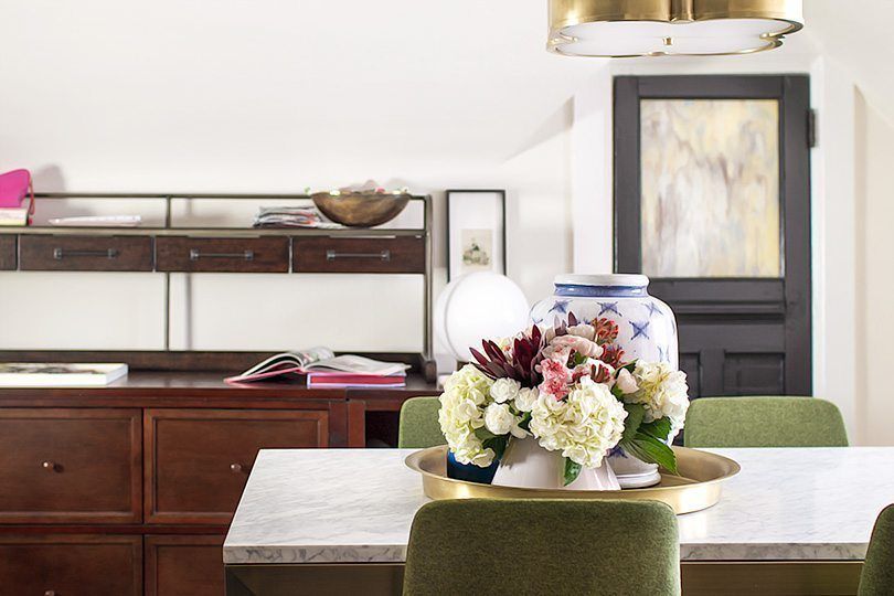
The brass pendant looks beautiful in this space. It replaced a ceiling fan and Nicole wanted the light centered over the table so she added a hook to the ceiling.
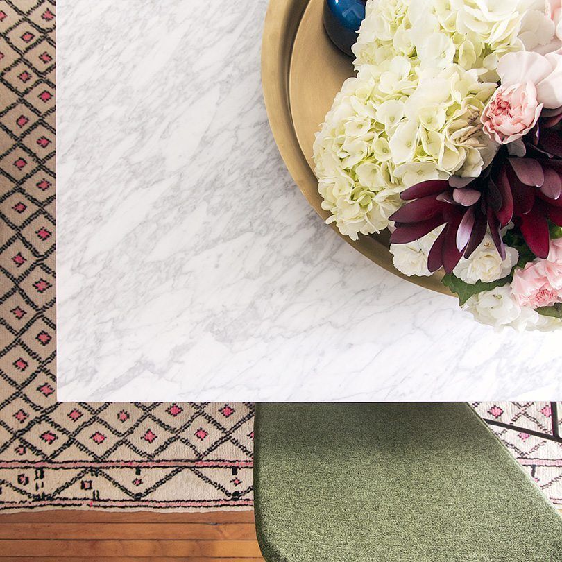
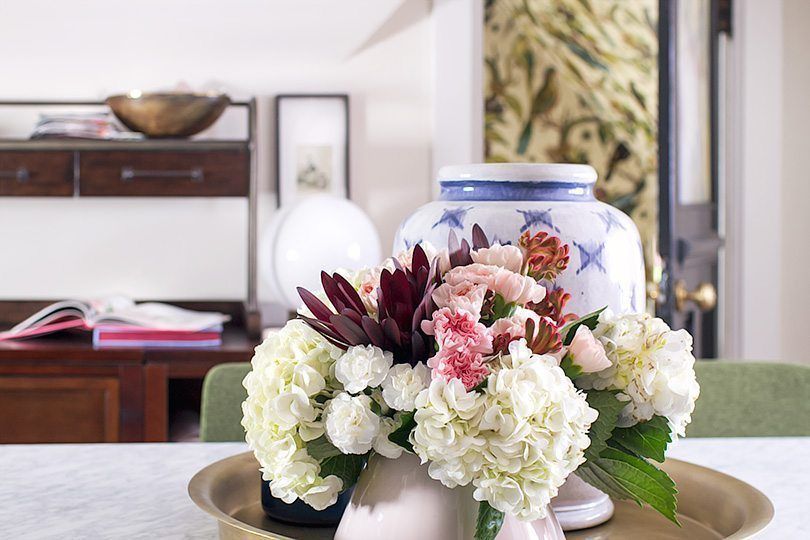
The center marble dining table is proving useful and gorgeous as well. It functions as a desk and a project planning surface. Nicole didn’t want another wood surface in the office since her desk and the modular storage were already filling those shoes. She is not a big fan of glass tops, so that sent her looking for painted, lacquered, or stone tops. She chose the classic parsons shape, and the combination of marble and brass is spot on. Green chairs in a mid-century modern style bring the element of fun to the room.
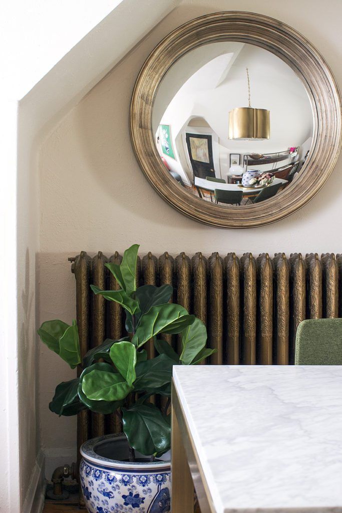
Nicole found a traditional but cool blue and white planter to put beside the heater. And above, a cool convex mirror that she grabbed from another room!
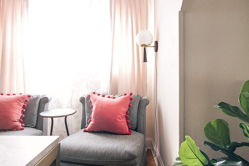
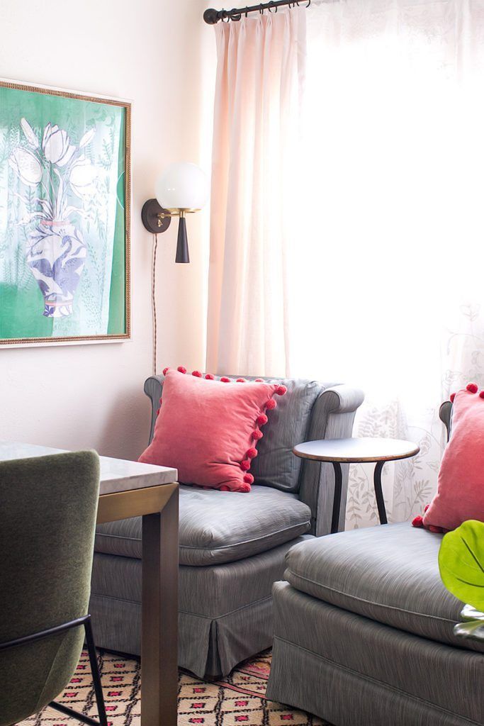
These vintage slipper chairs are from Nicole’s first One Room Challenge.
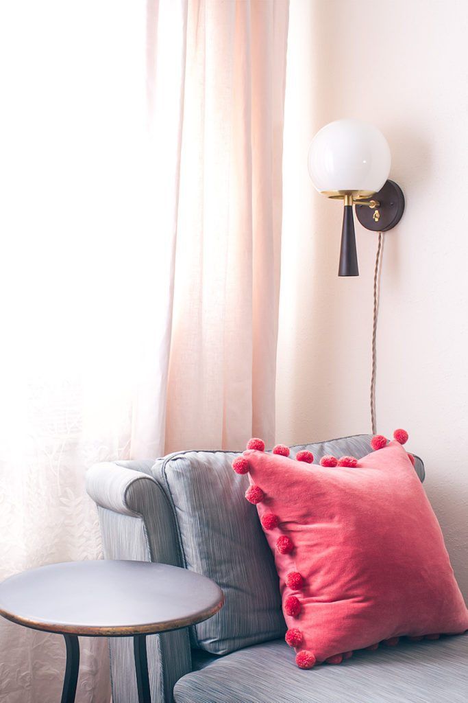
The little side table between the two chairs is dainty but sturdy. She wanted sconces that could plug in, which these can do and chose pretty French gray fabric cording. They’re a bit contemporary and a bit Art-Deco and both parts lovely. The lights were previously six inches higher but they didn’t look quite right. So she took them down, patched and painted the holes, and put them back up 5-1/2″ lower. It was an hour’s worth of work for a small change, but some times it’s necessarily to put in that time to avoid later regrets.
She took her pale pink linen curtains from a different room, and the embroidered sheers arrived in time for photos.
Nicole recently created a “Shop Our House” page, where you’ll find sources for everything there, including paint colors and links to the exact items she used. The Home Office section is new and she will continue to populate it. You can also take a look at the design plan from week 2.
Nicole closes her blog with a final note: “Thank you to all of you for following along! Thank you to Linda of Calling it Home for inviting me back to participate again, and thank you to my ORC sponsors for helping me bring this room to life. I’m thrilled with my new office, and I hope you enjoyed watching the process as much as I loved bringing the design to life!”
Thanks for sharing your journey, Nicole! It was a lovely read. For more from her blog as well as a list of sponsors of the One Room Challenge, visit Making It Lovely.
