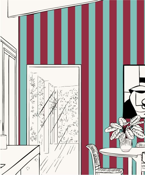
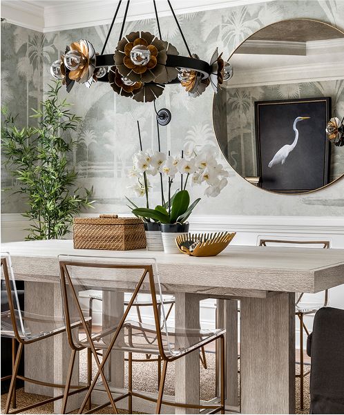
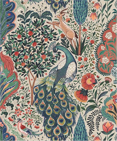
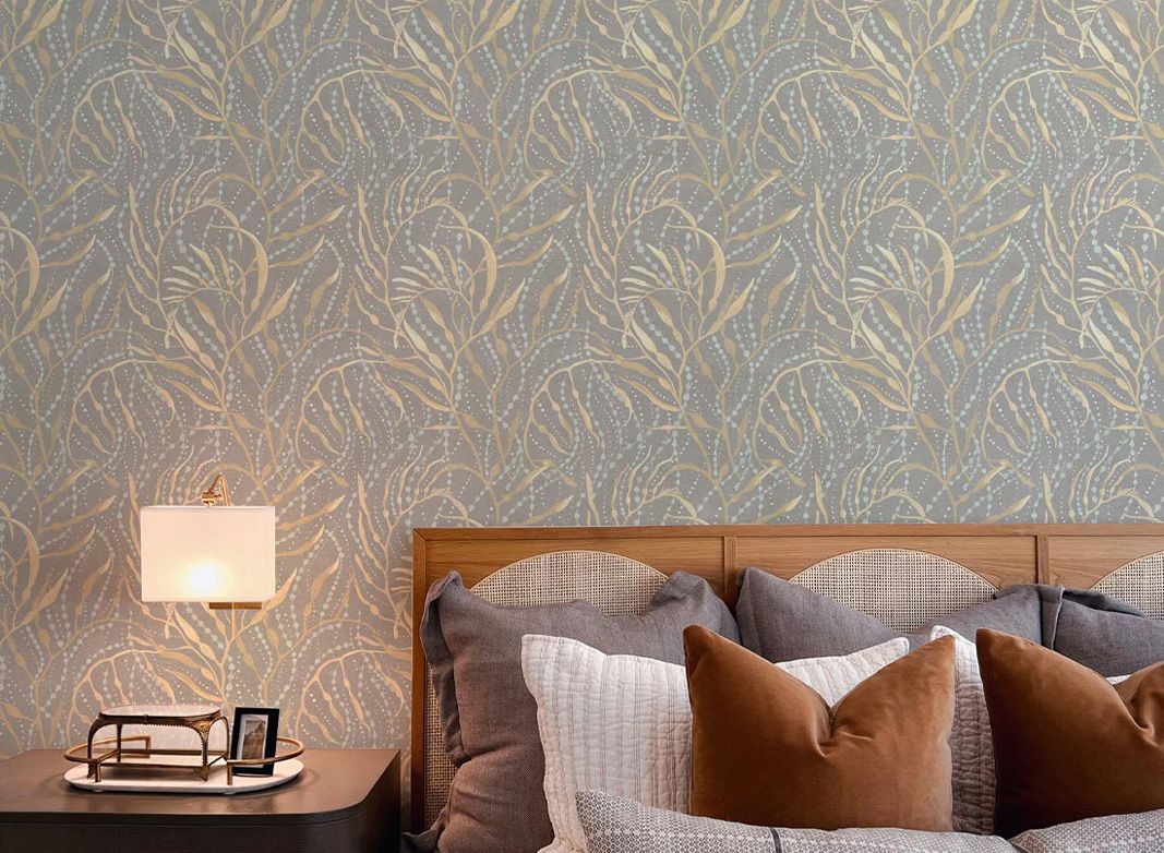
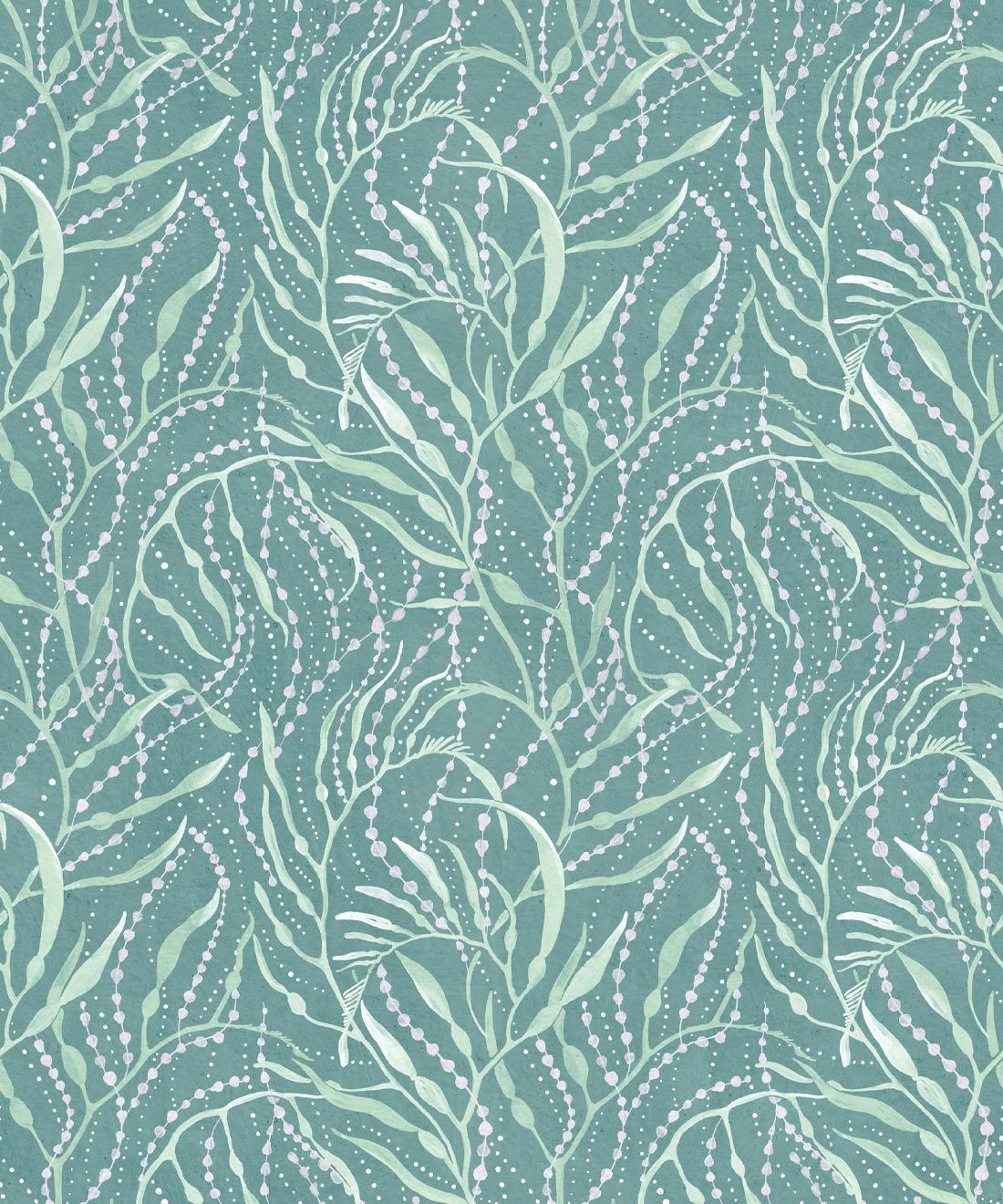
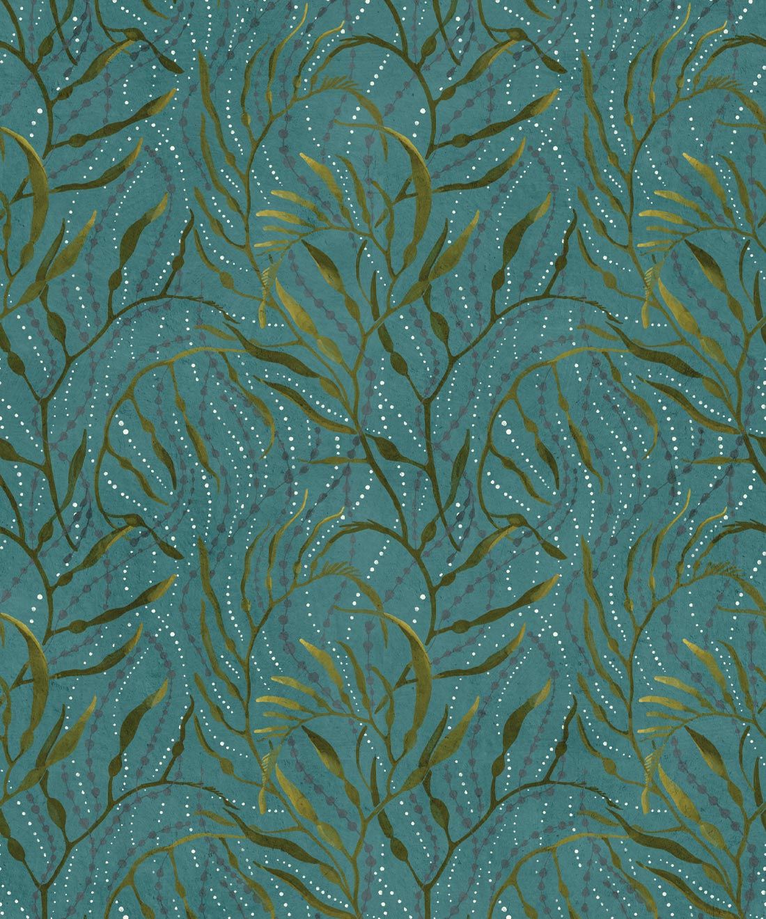
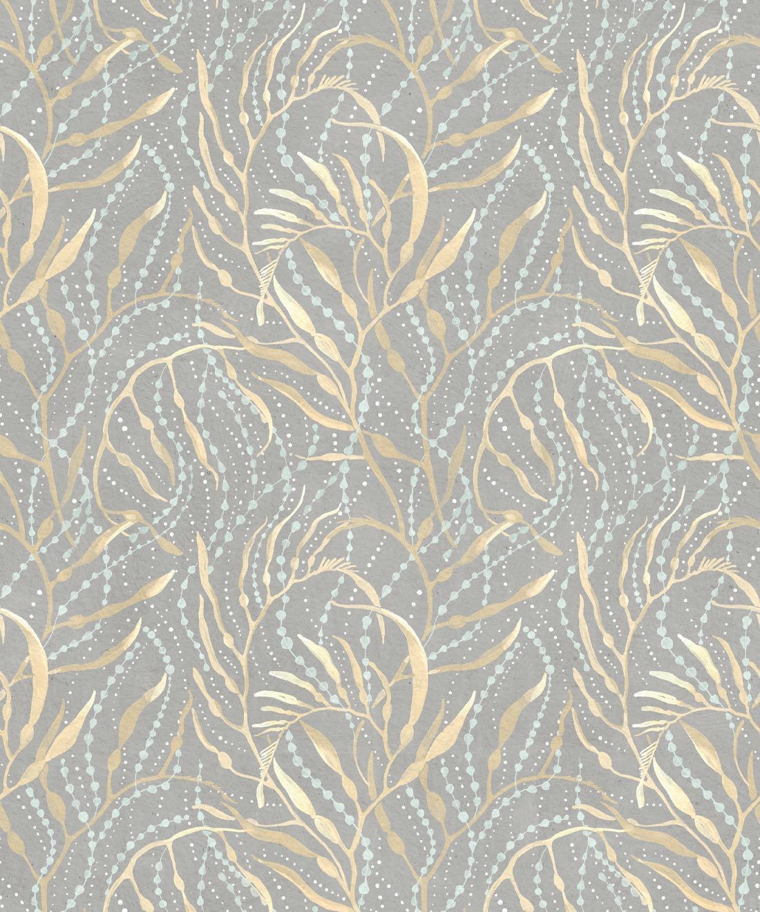
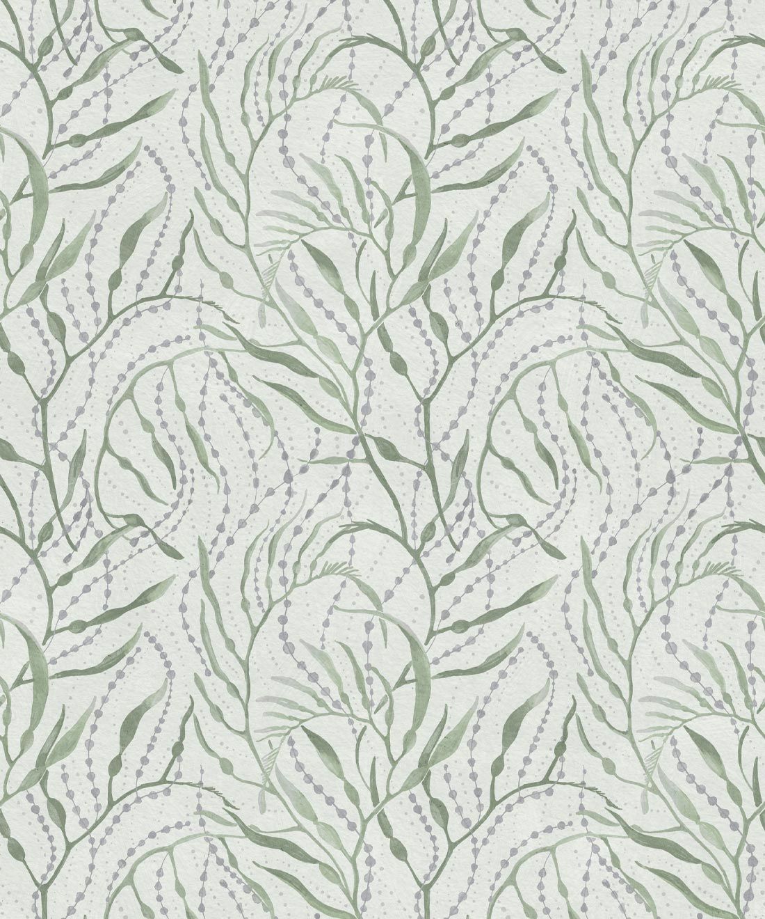
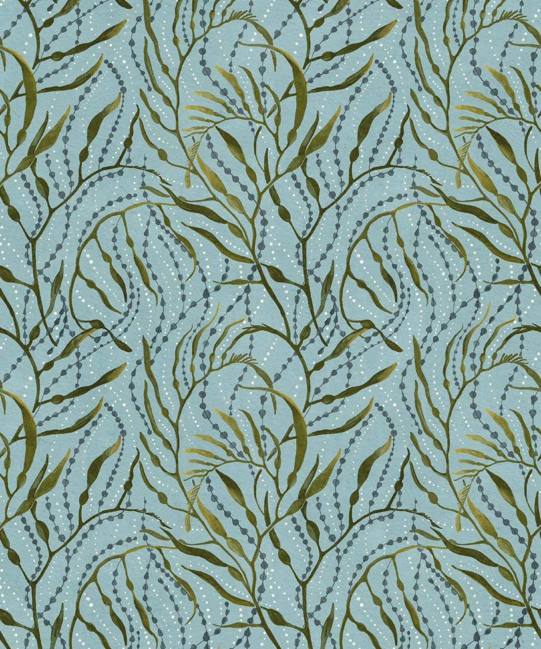
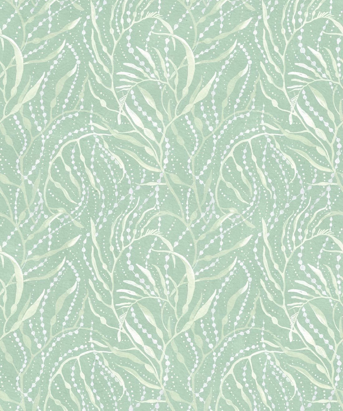
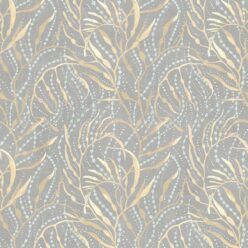
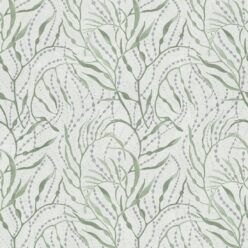
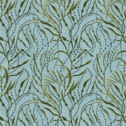
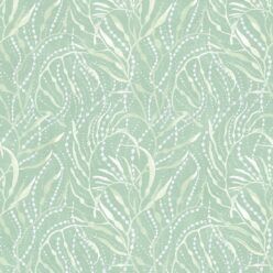
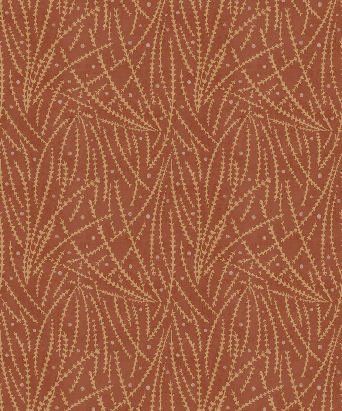
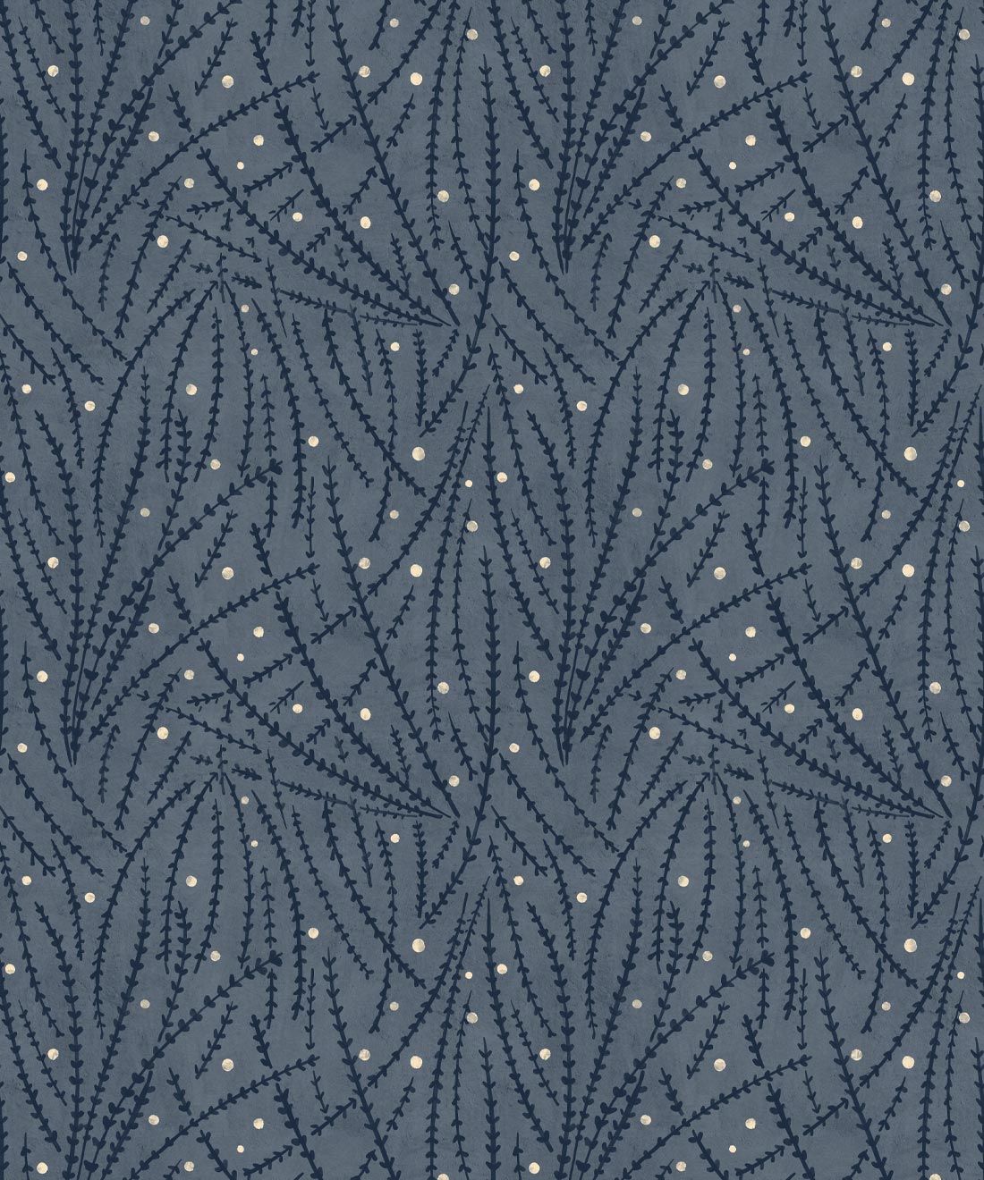
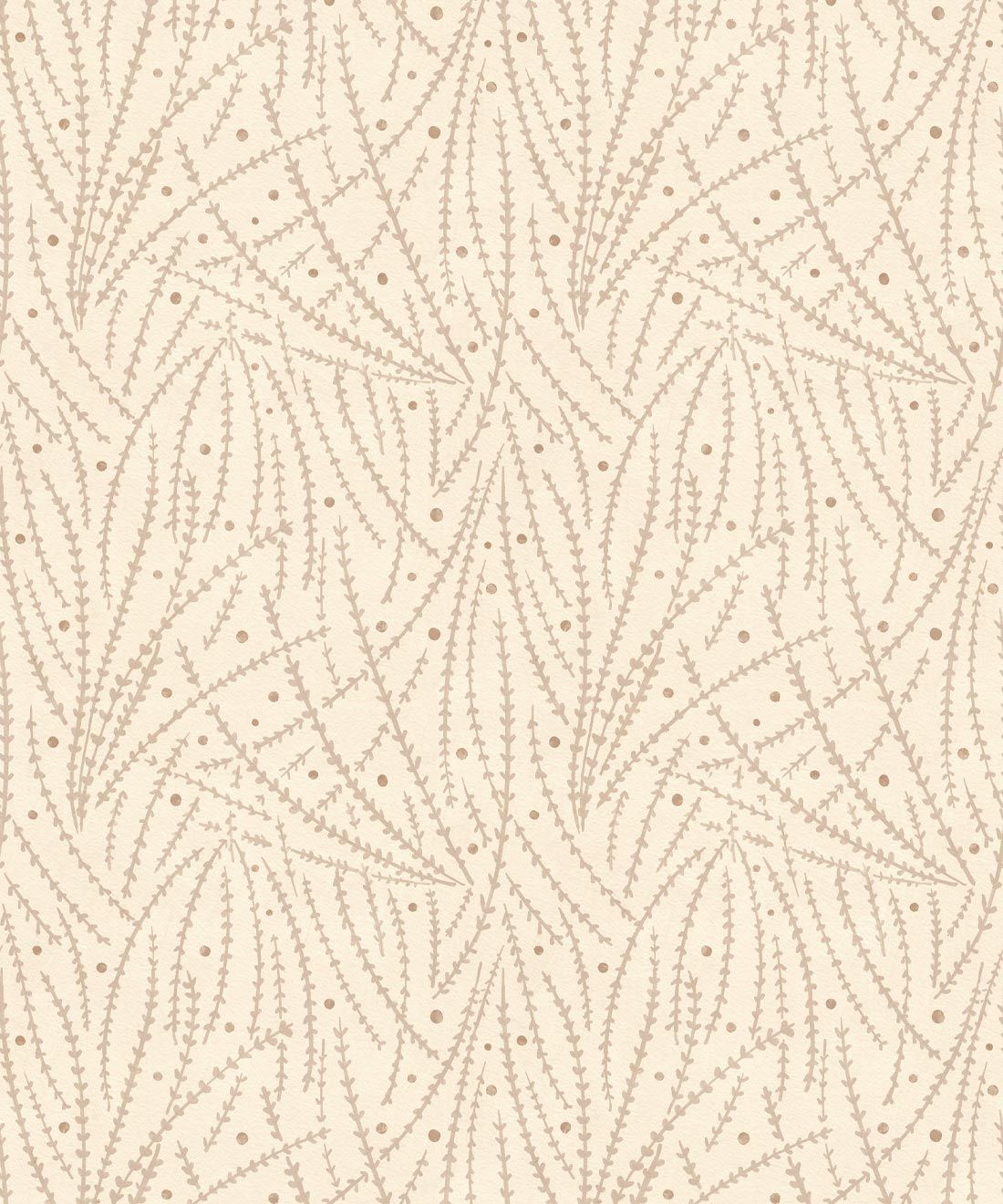
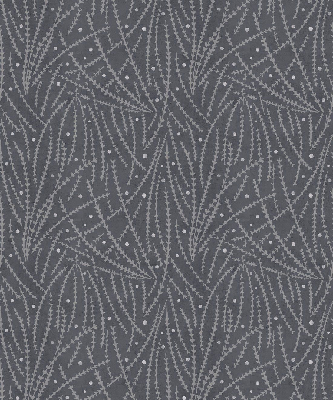
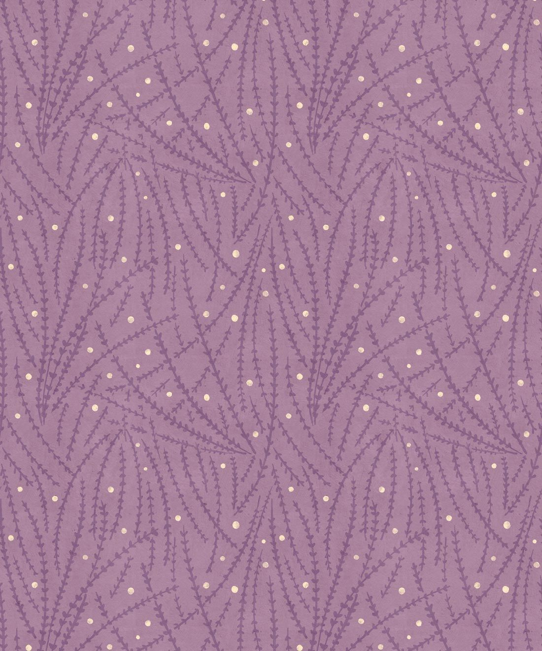
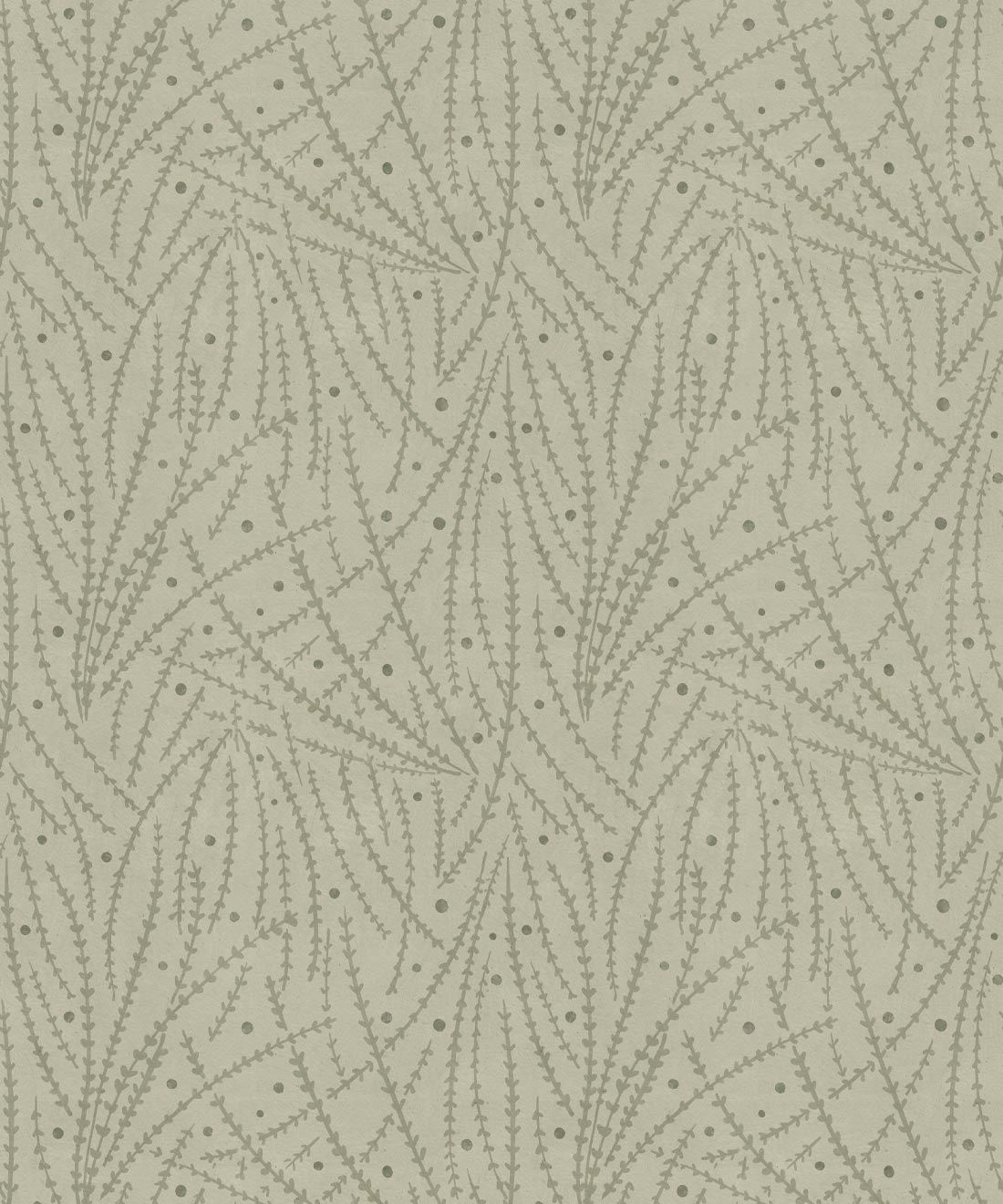
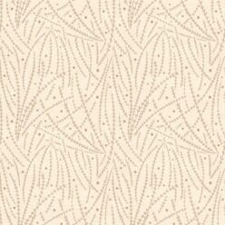
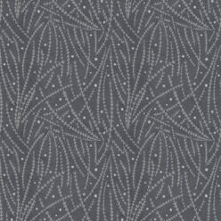
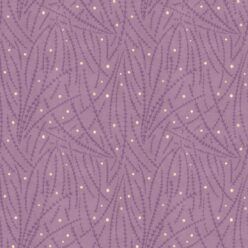
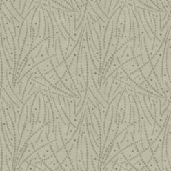
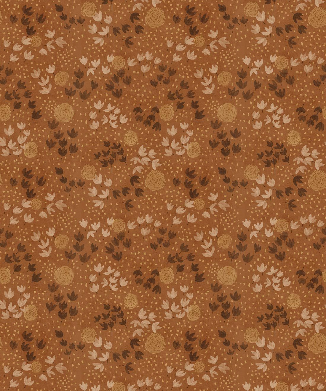
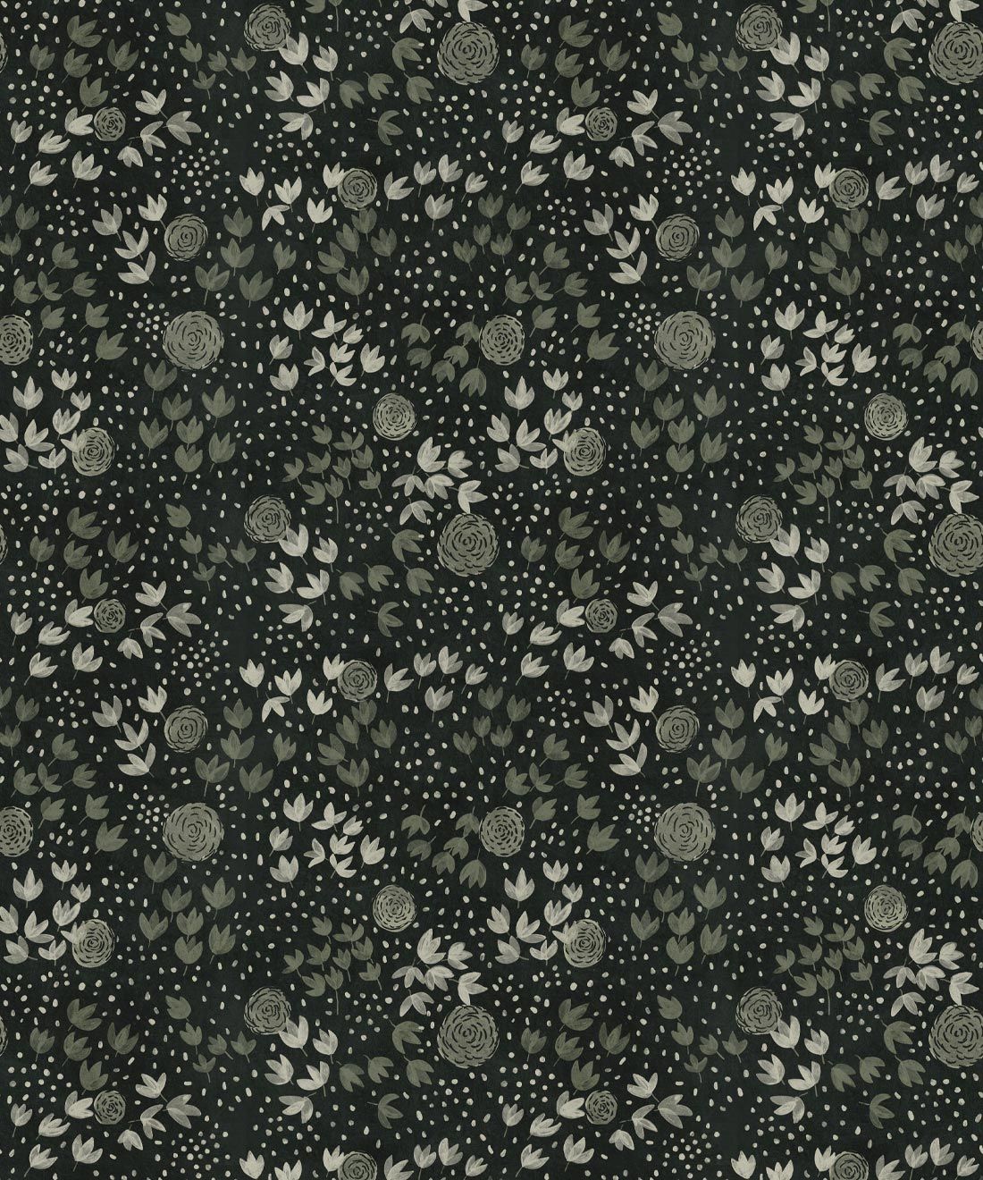
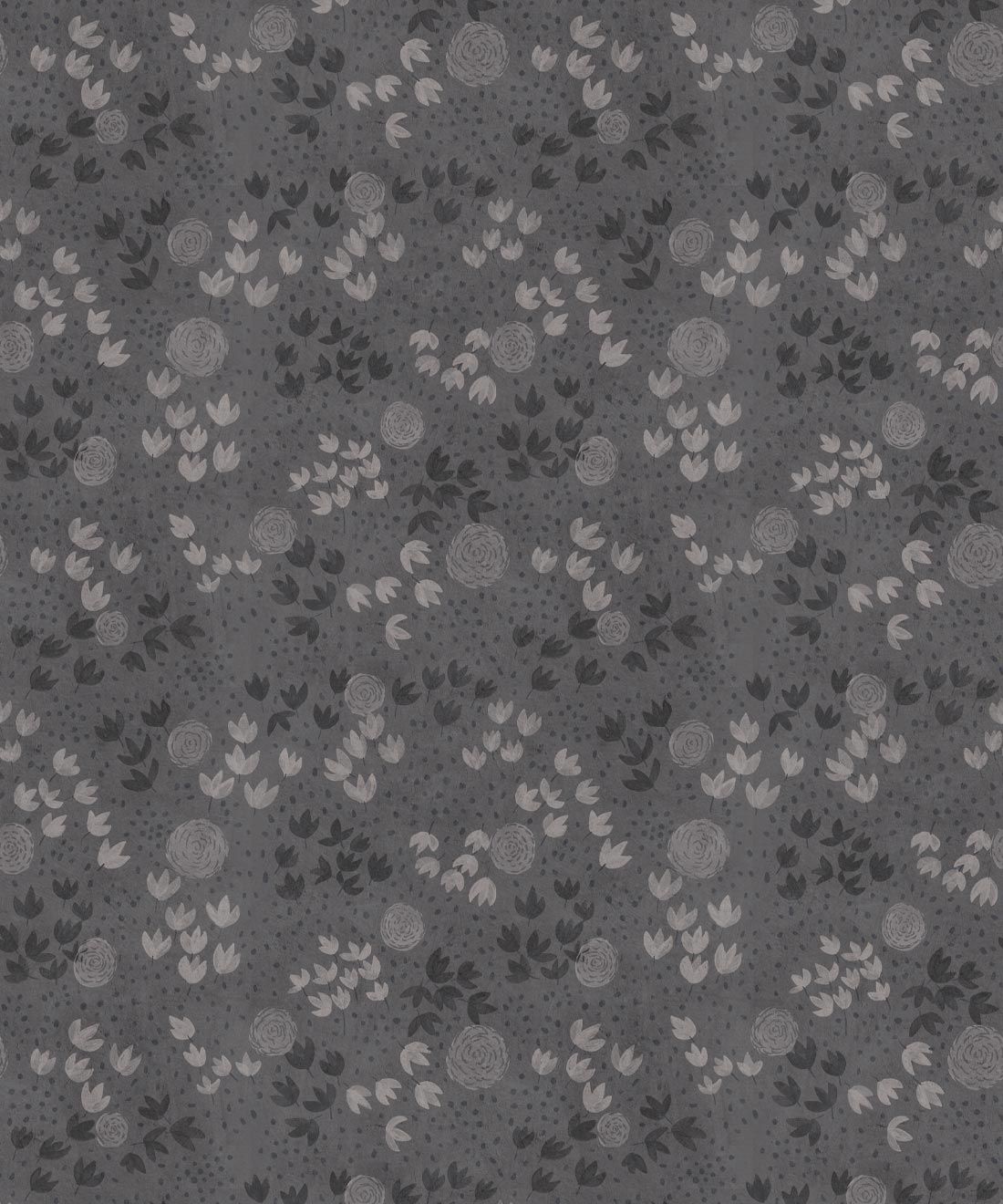
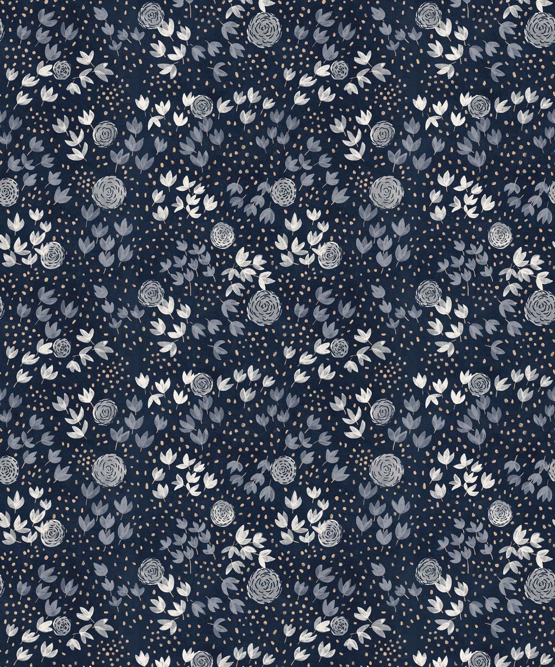
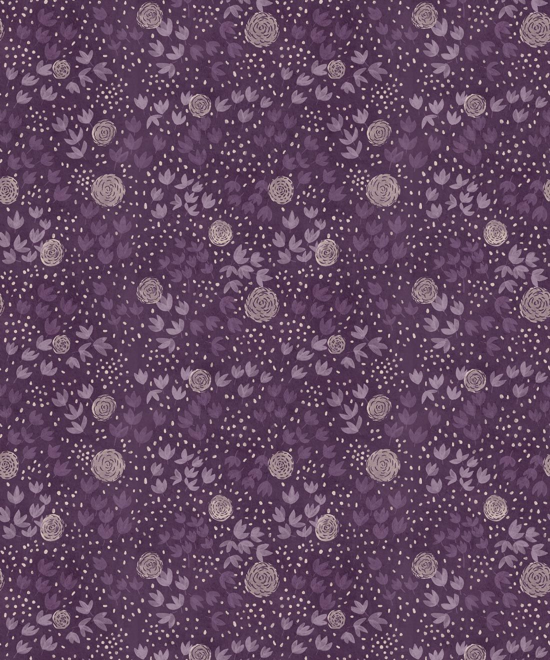
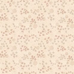
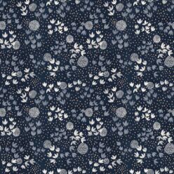
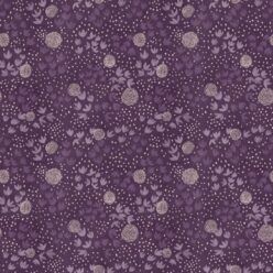
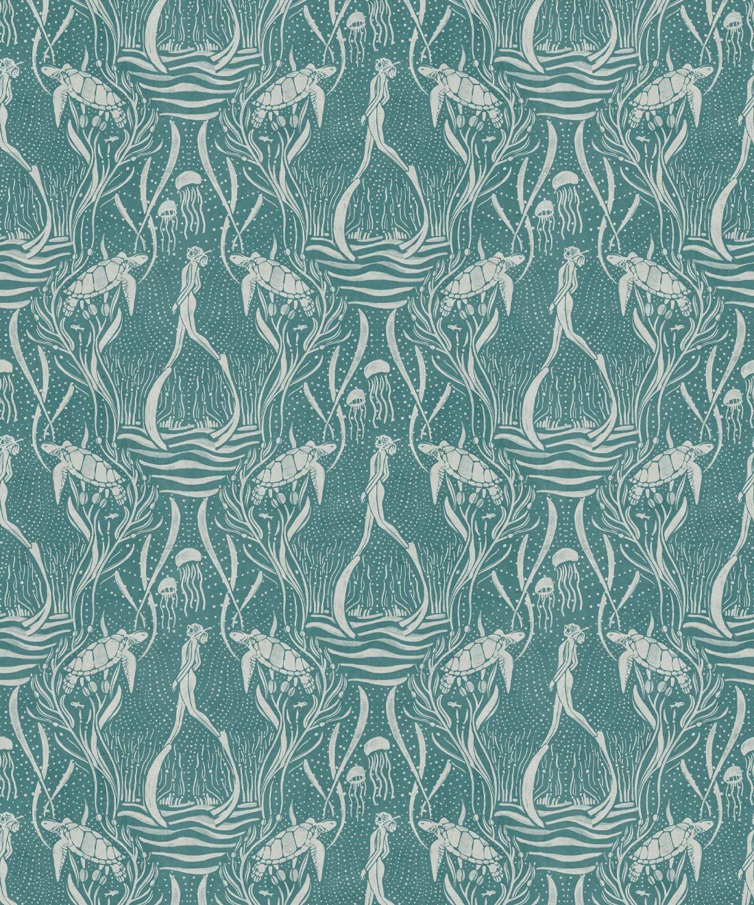
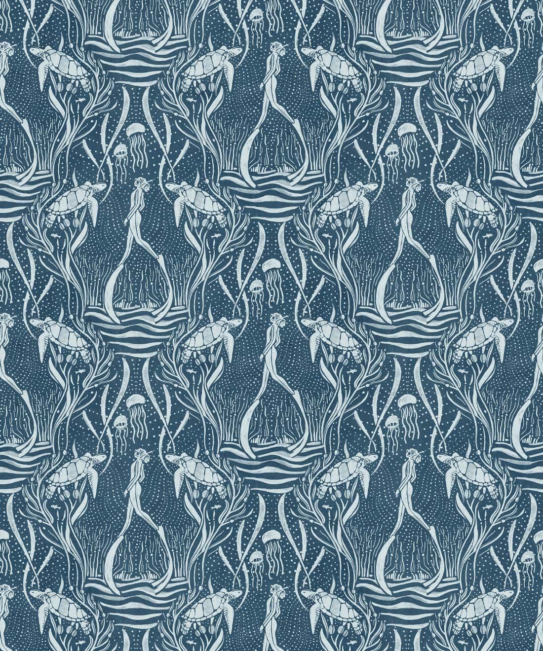
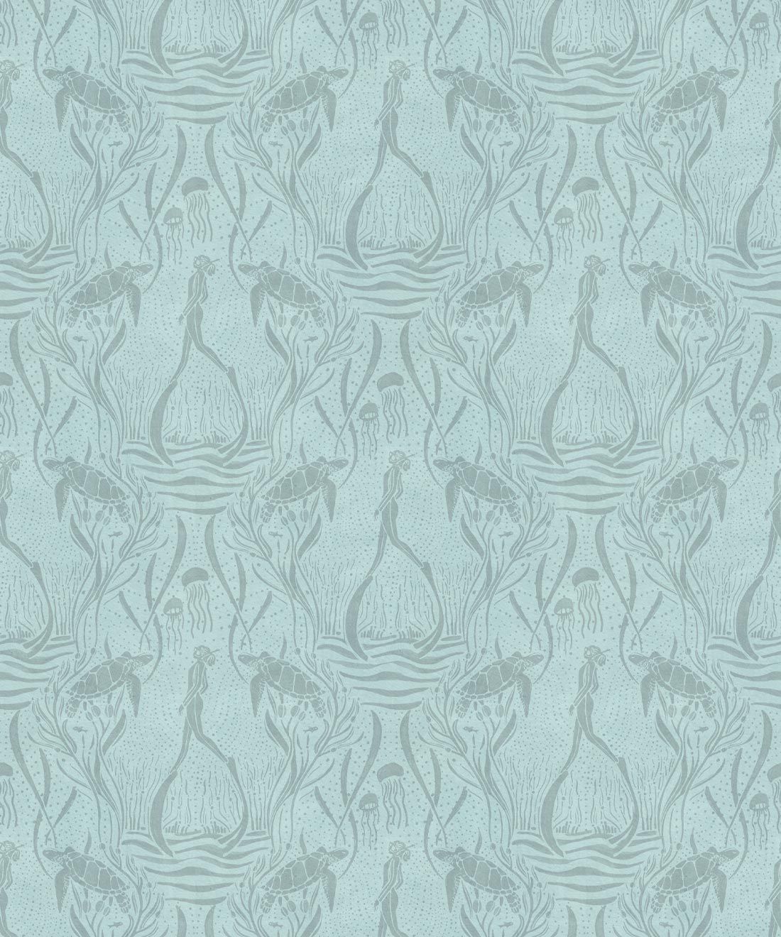
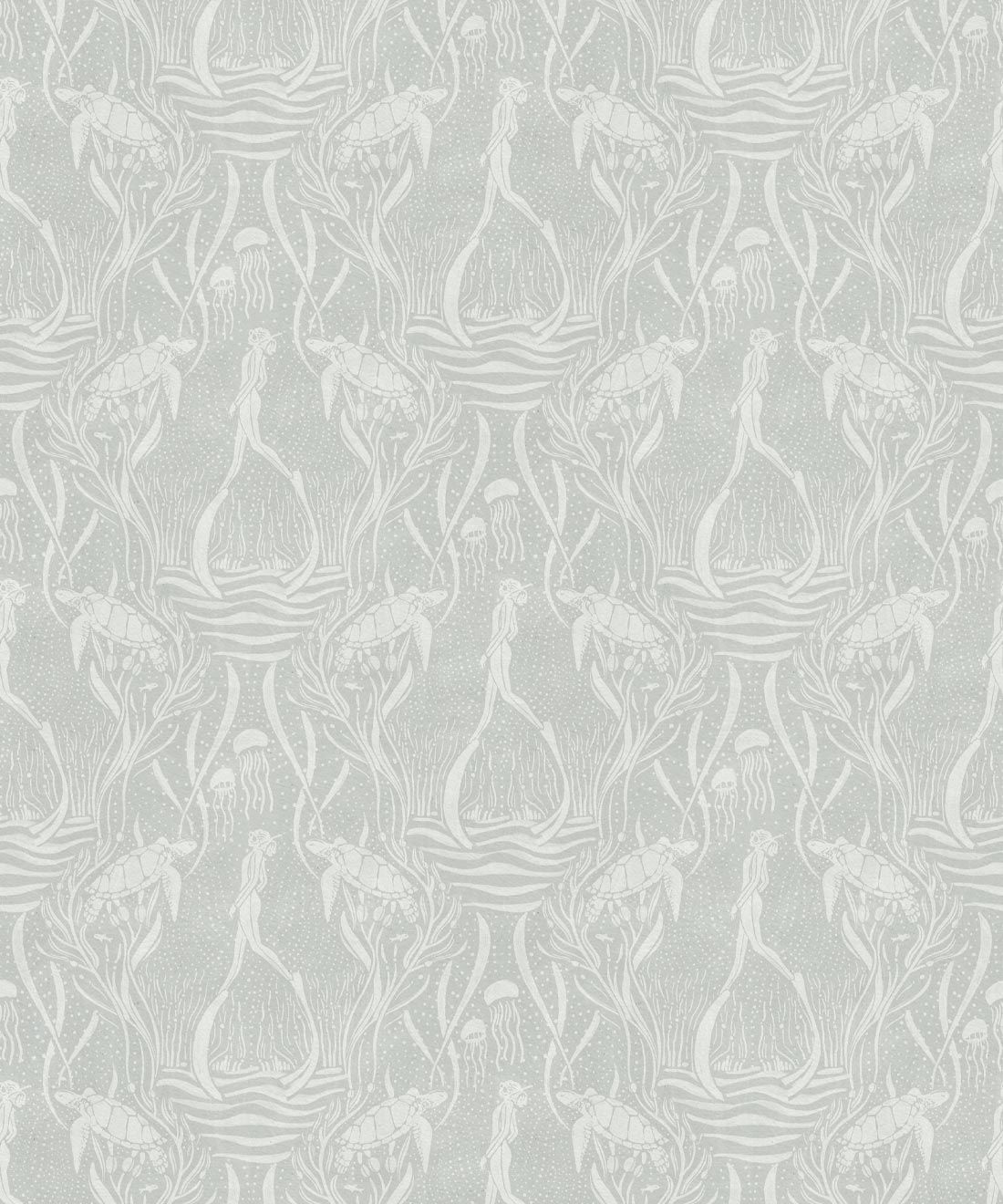
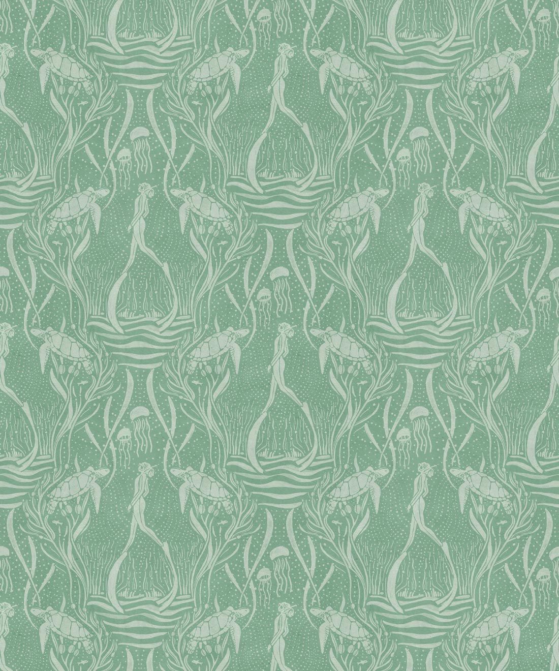
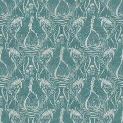
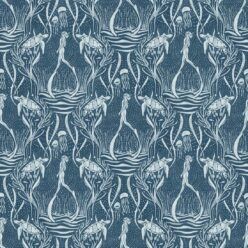
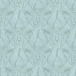
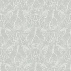
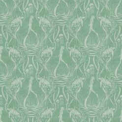
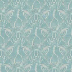
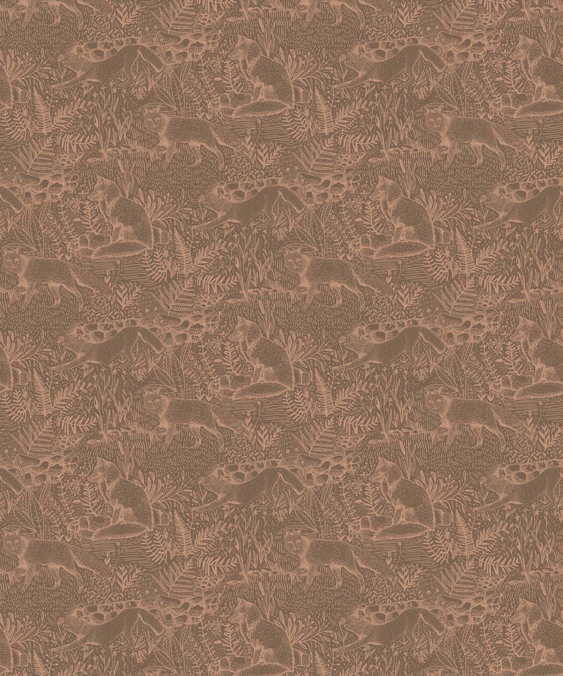
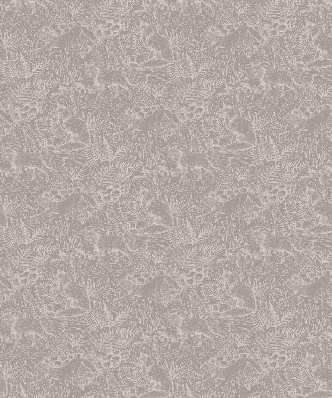
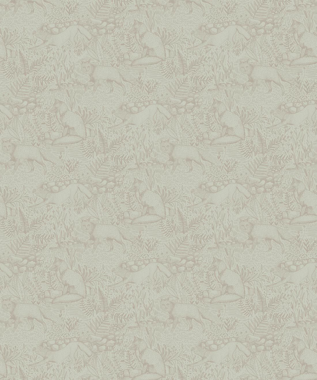
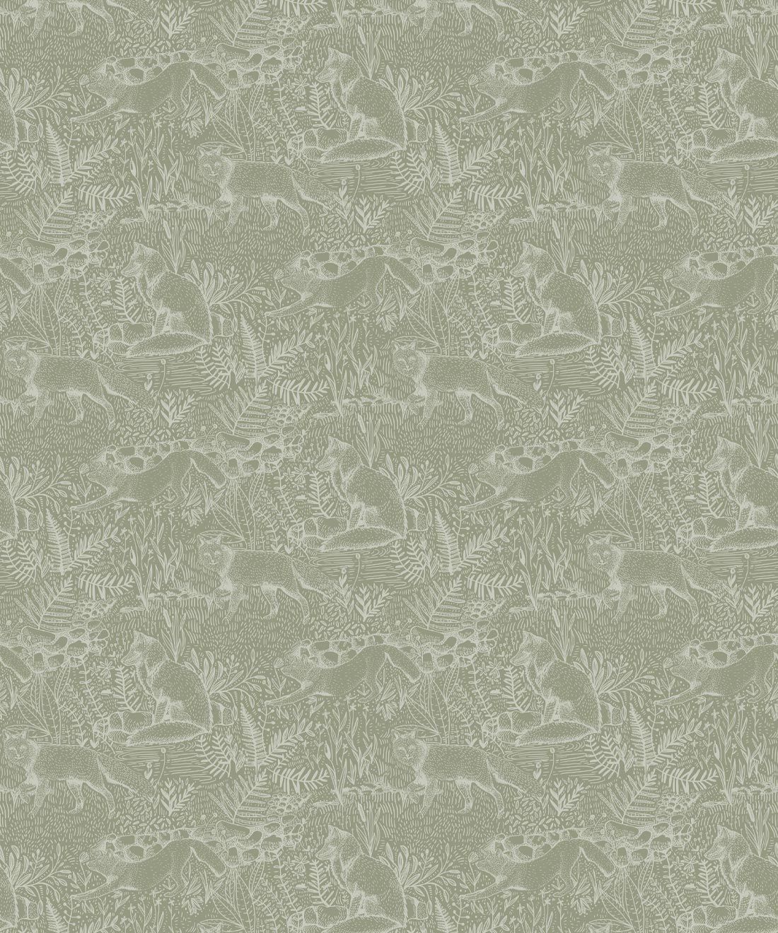
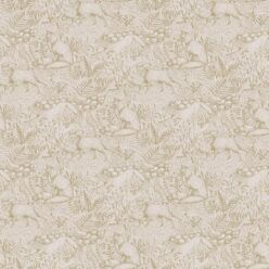
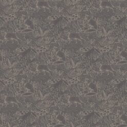
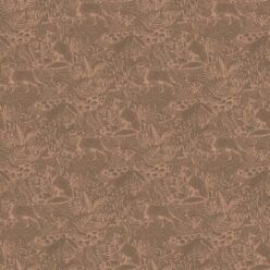
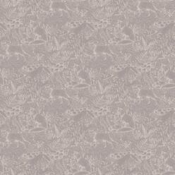
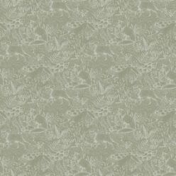
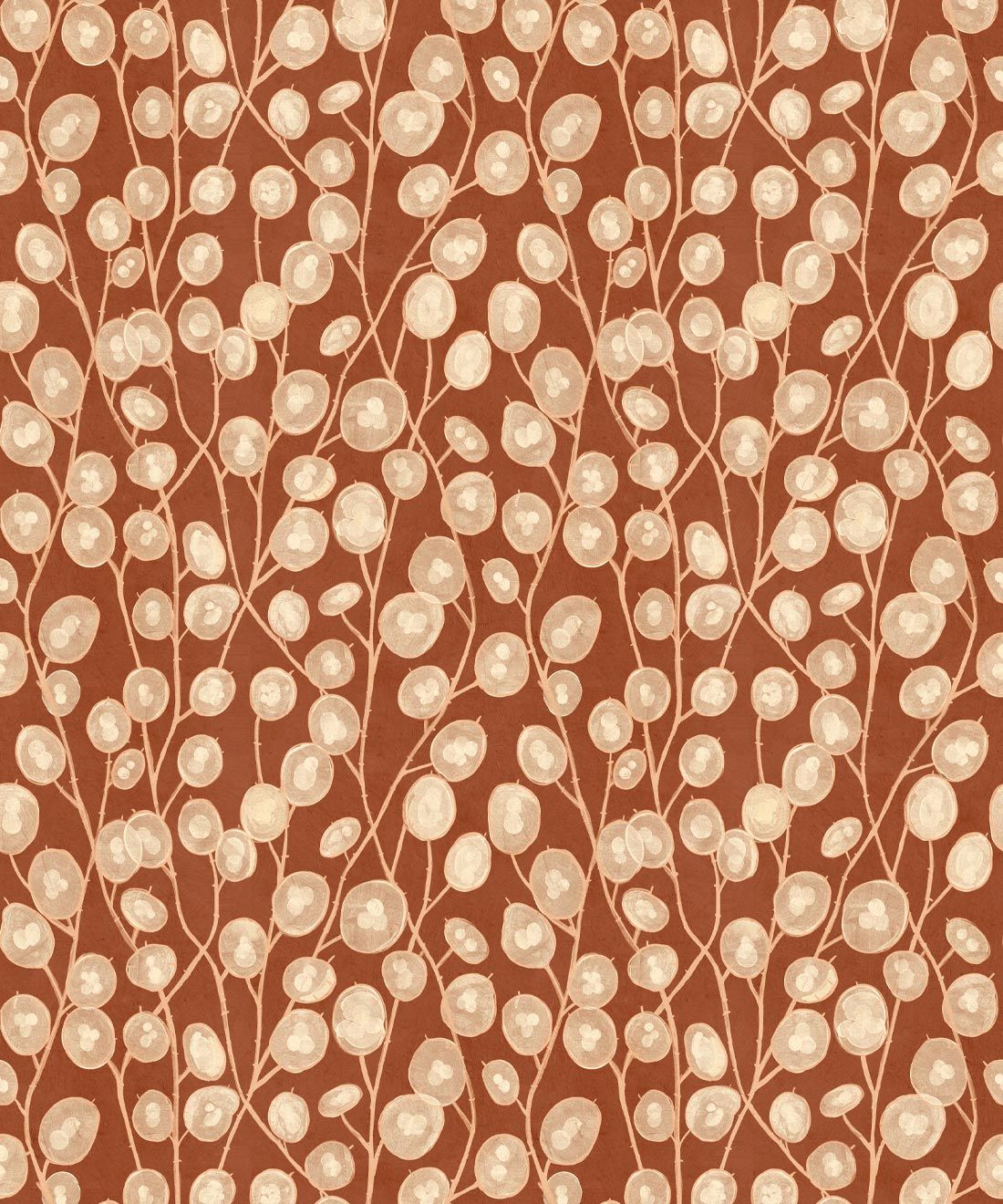
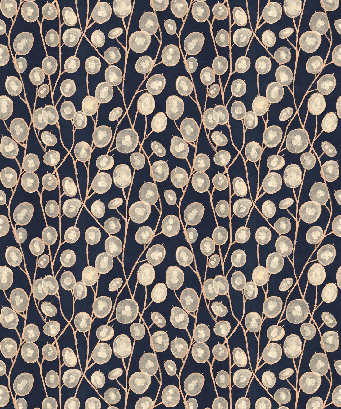
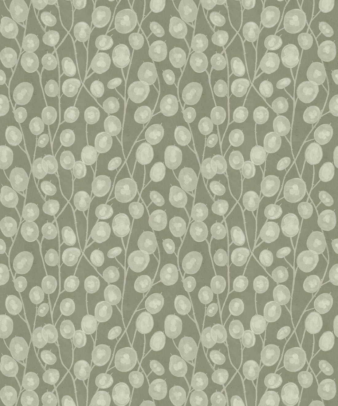
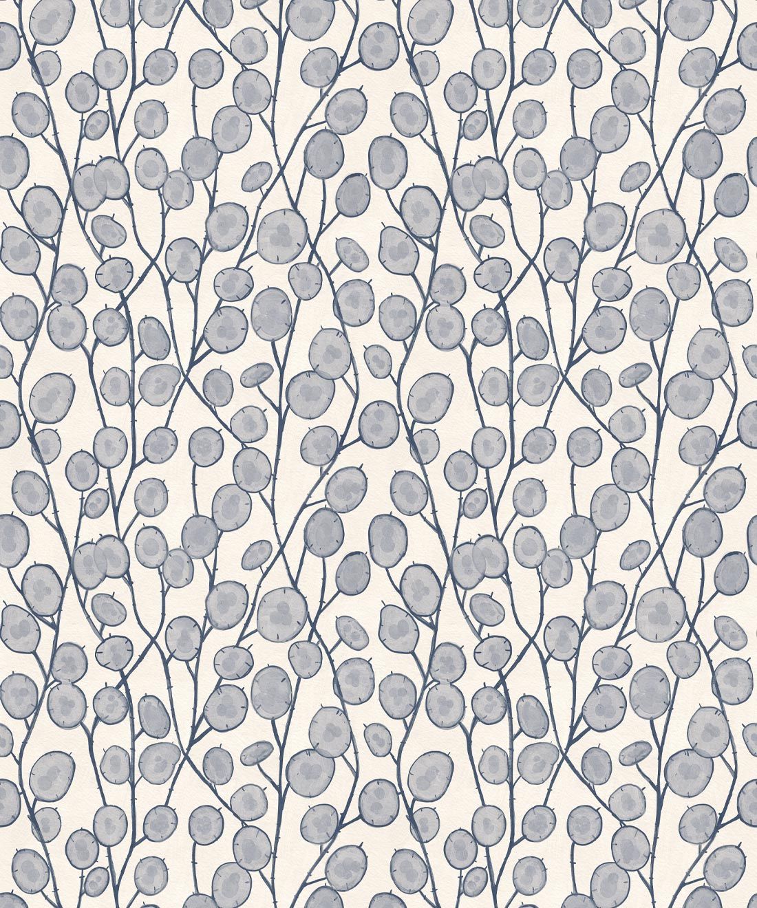
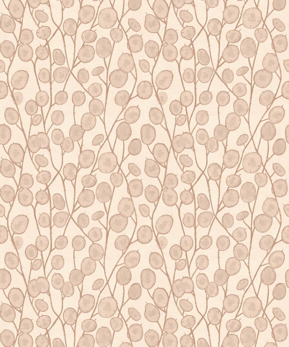
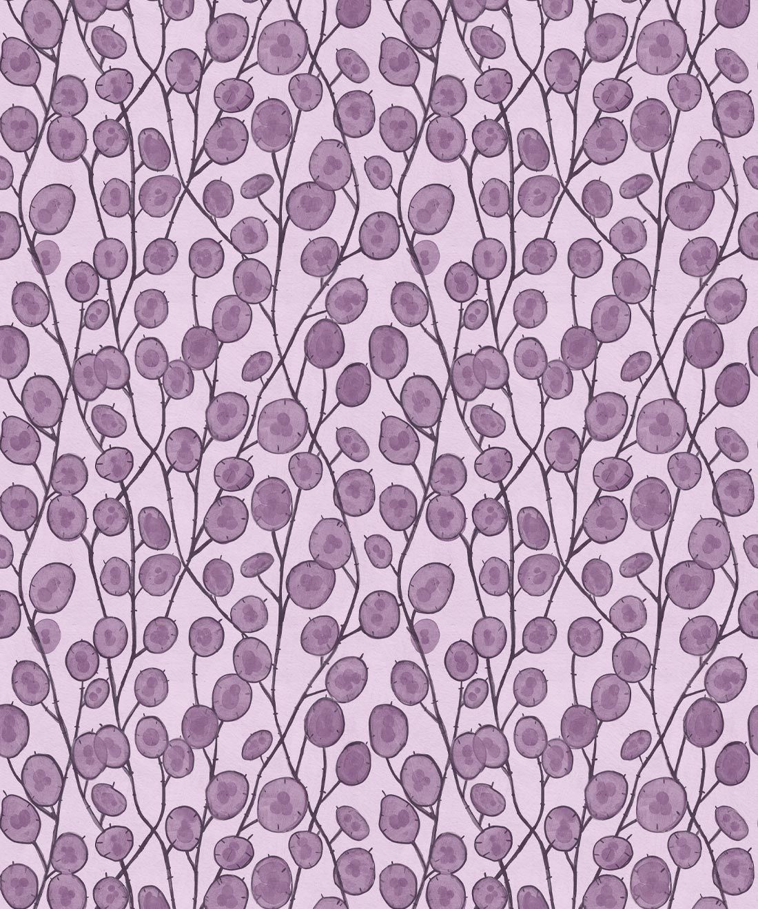
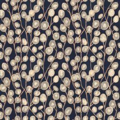
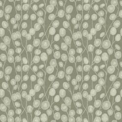
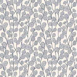
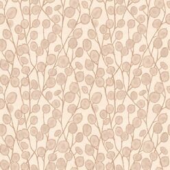
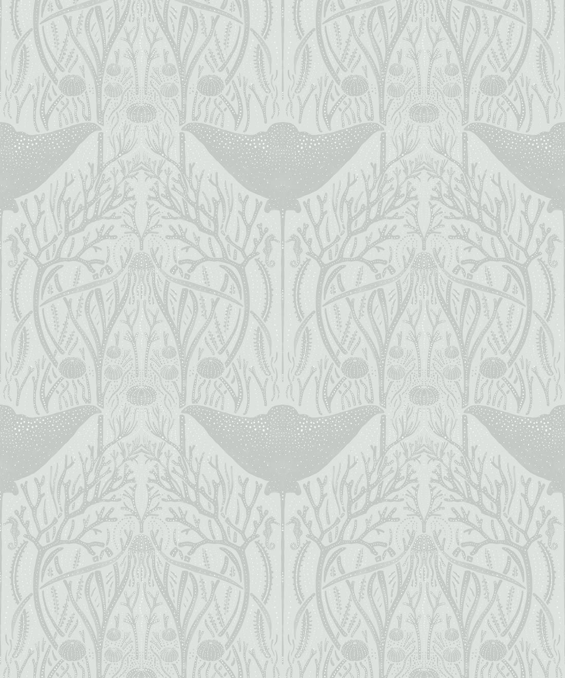
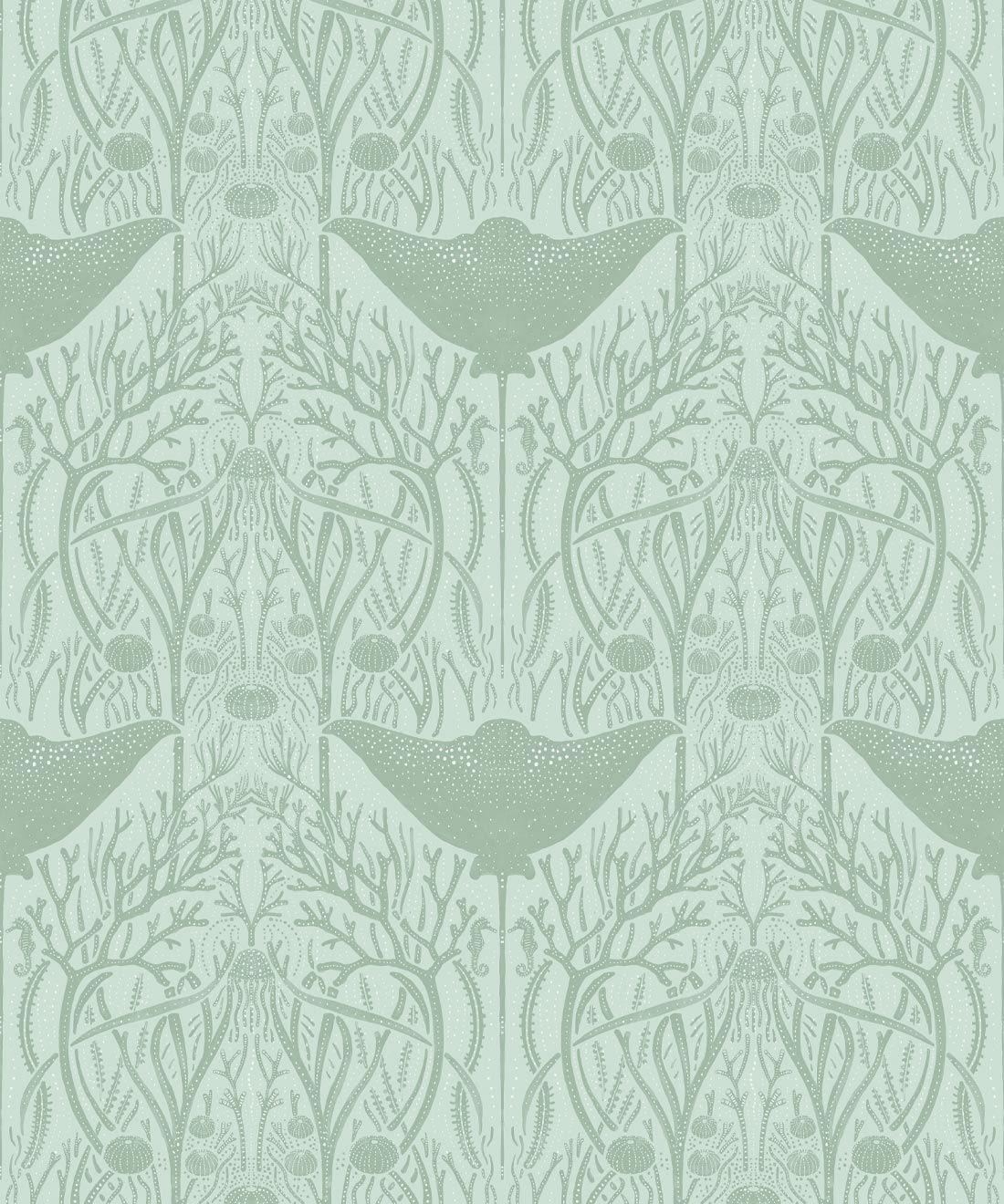
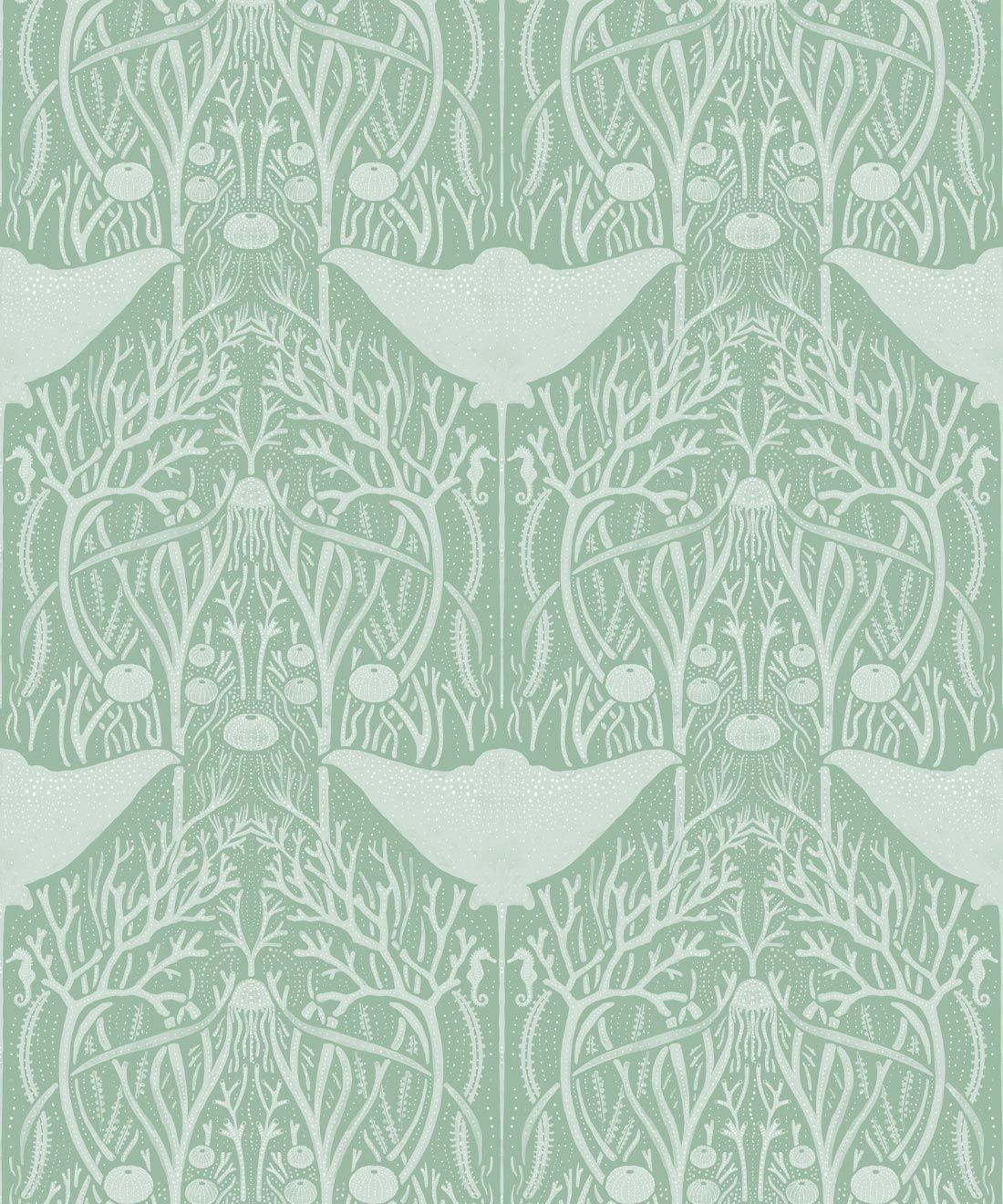
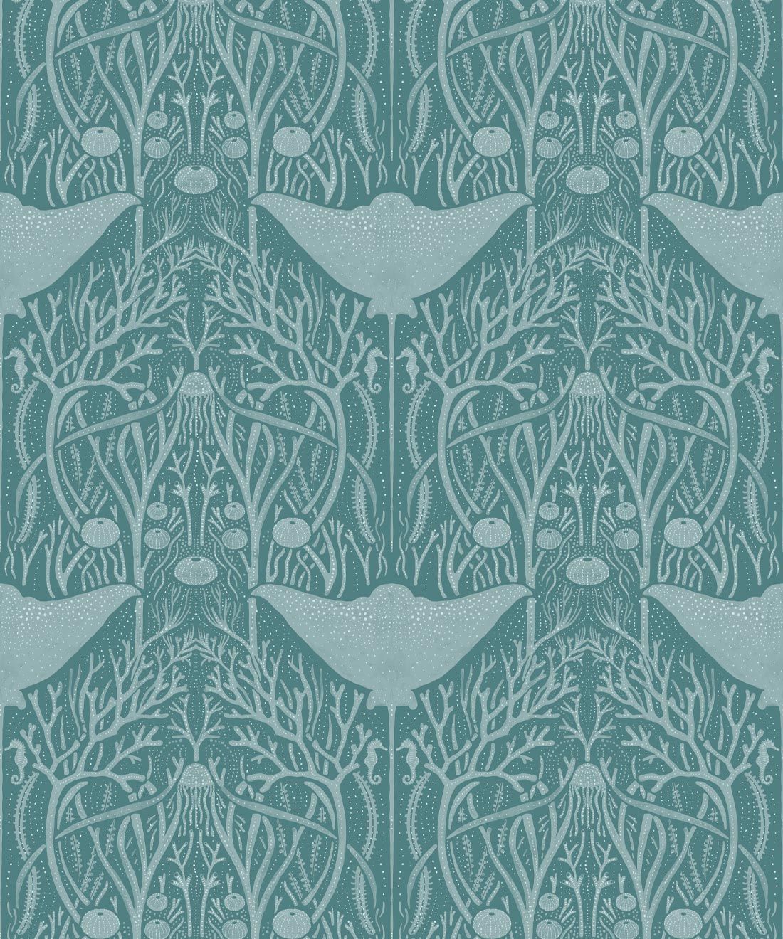
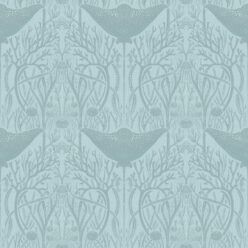
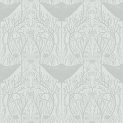
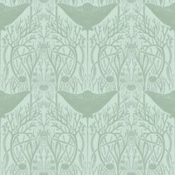
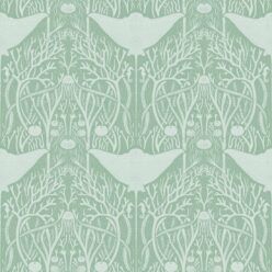
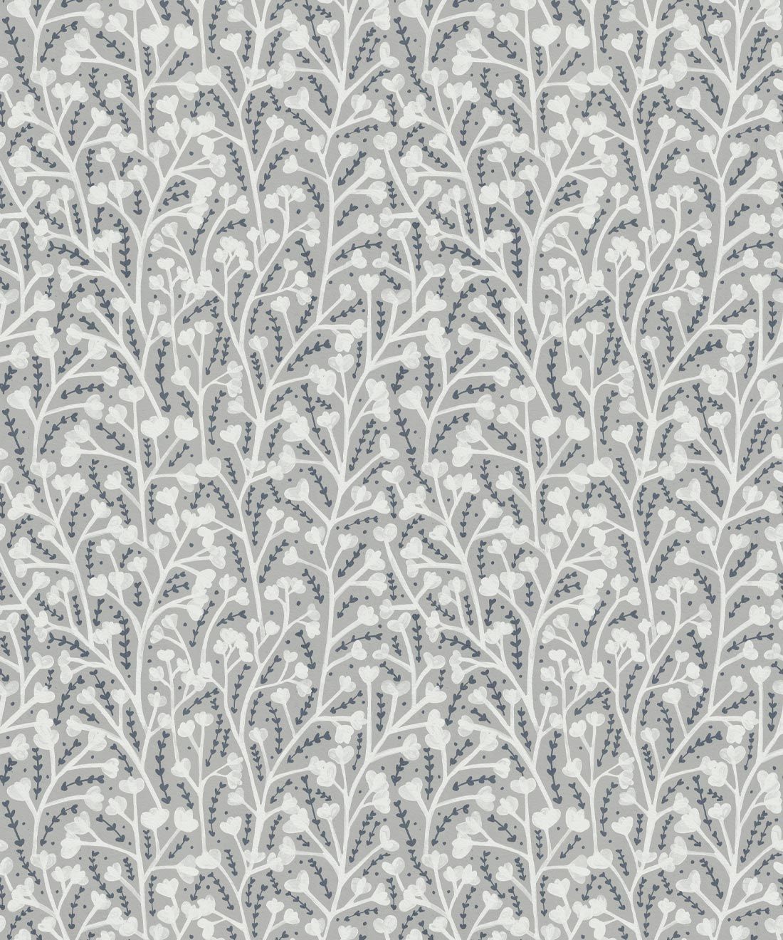
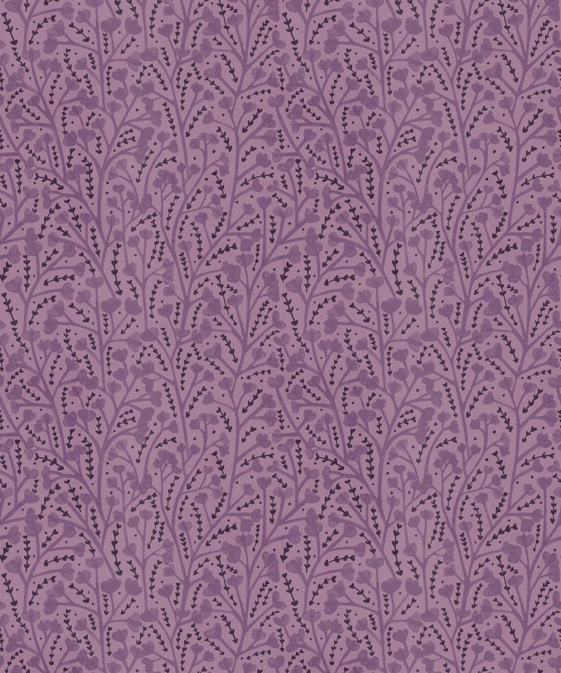
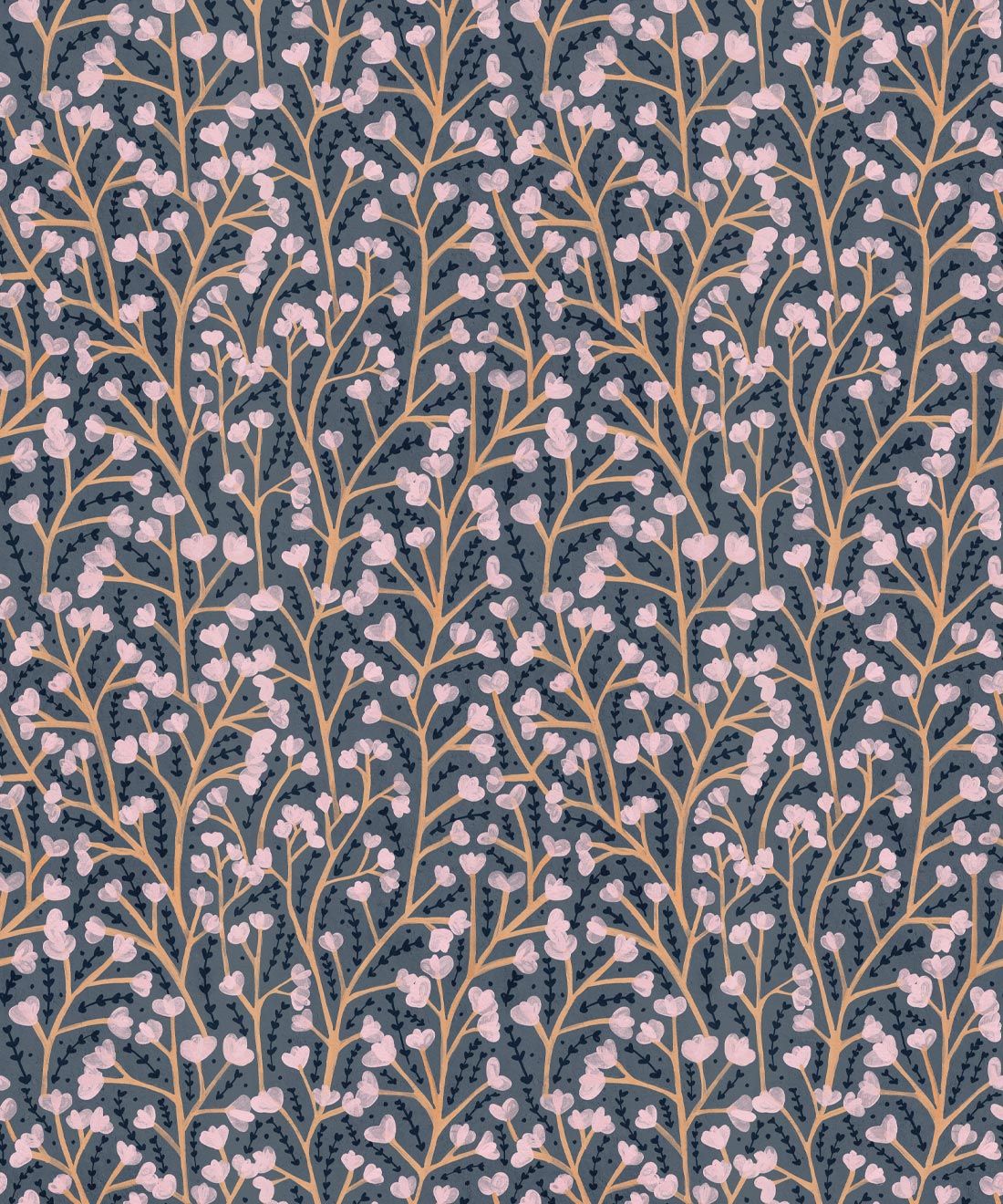
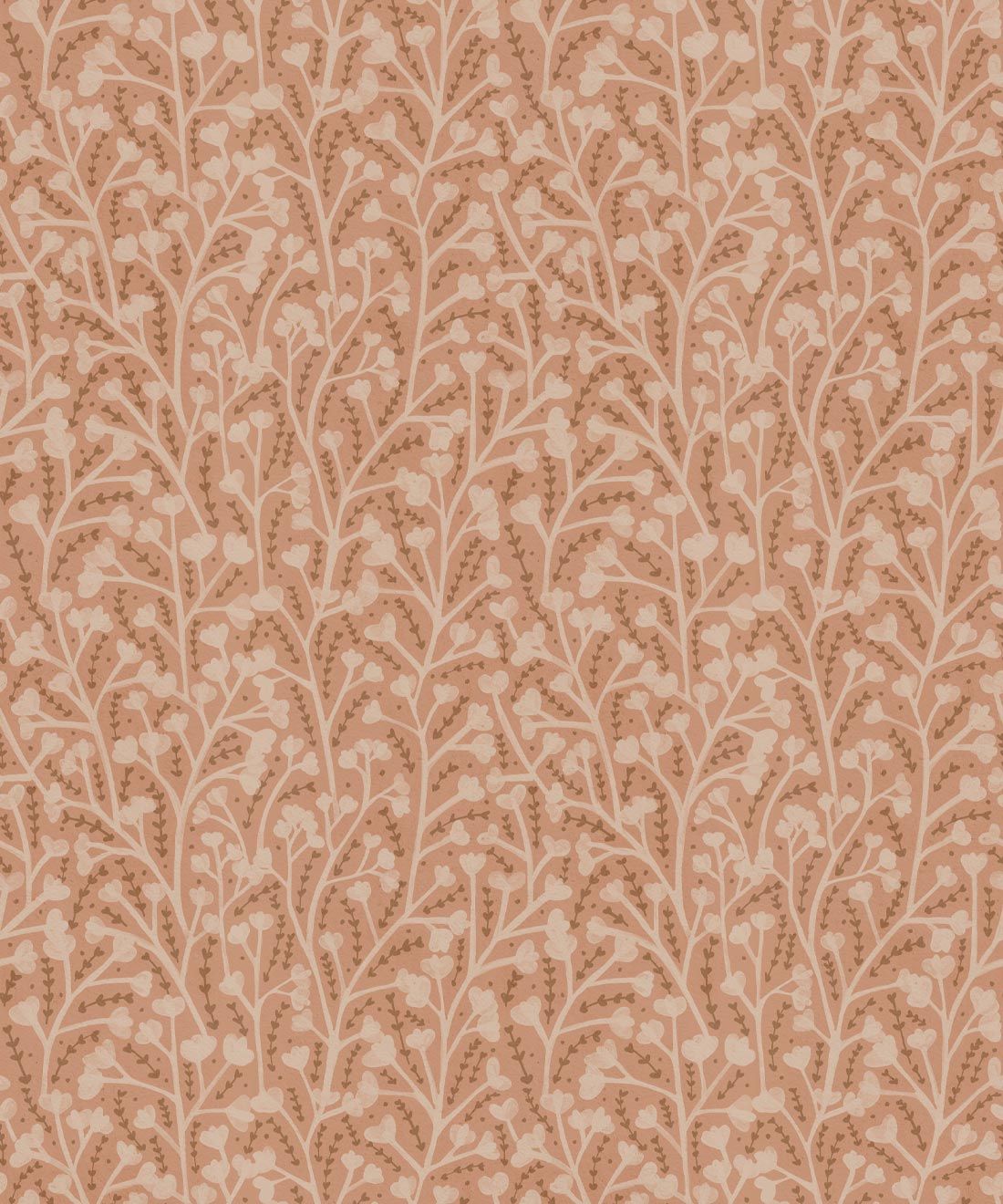
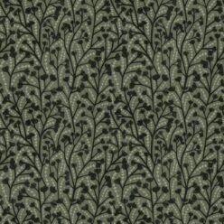
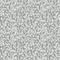
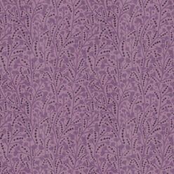
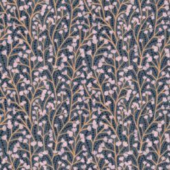
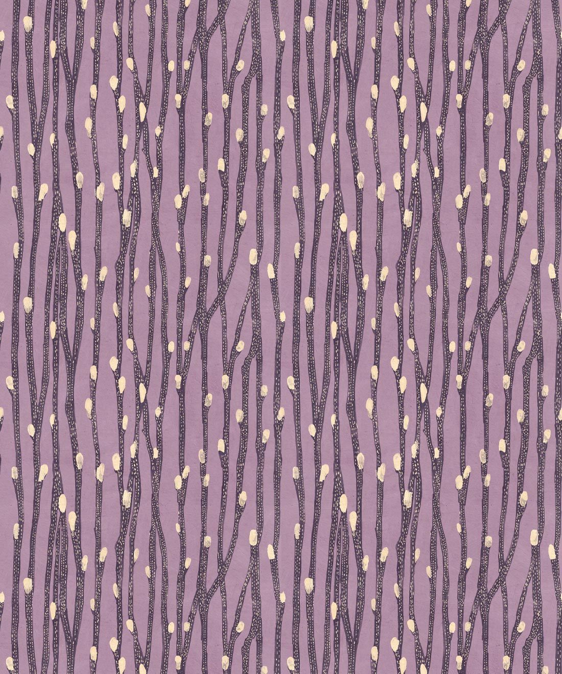
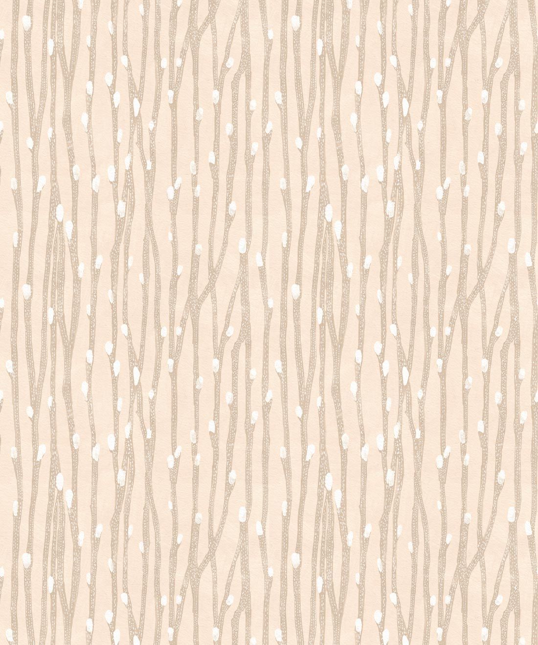
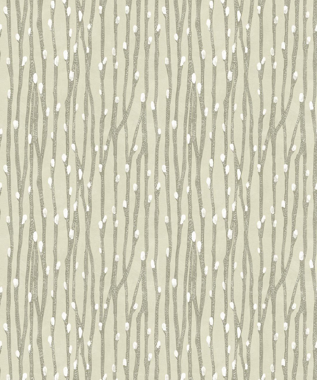
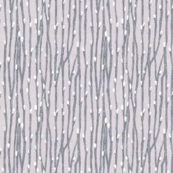
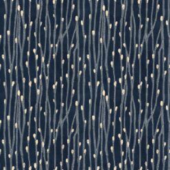
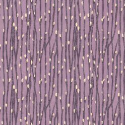
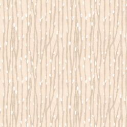
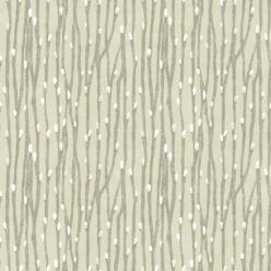
Image above of the Neptune’s Necklace Wallpaper in the Gray colorway
Milton & King: Tell us a little bit about you. We know you live in Northern California, and studied graphic design at Rhode Island School of Design, but what else can you tell us about Katie O’Shea?
Katie O’Shea: I was born and grew up in Northern California. I come from a family of artists, my mom is a painter, and my dad is a printmaker. Art has always been strong in our family, so it seemed like the natural thing to do, growing up. I lived on the East Coast for a bit after graduating from RISD, but the West Coast always felt like home, so I moved back in my early 20’s.
M&K: When did you realize that you wanted to be a designer? Is it something you’ve felt compelled to do since childhood, or was it a more recent discovery?
KO: I thought as a kid I might want to do something different, like acting, but once I realized in high school that art was what I was good at, I knew that I wanted to pursue a career in either painting or design. Once I got to art school, we had to choose our direction and I felt like being a designer was the only realistic way I could make a living.
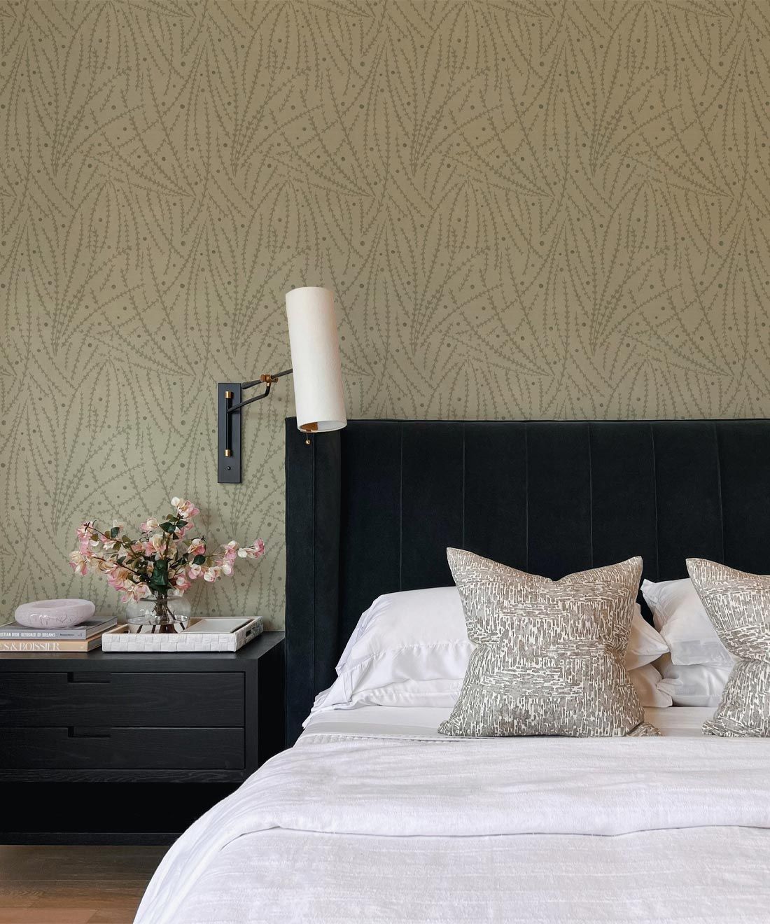
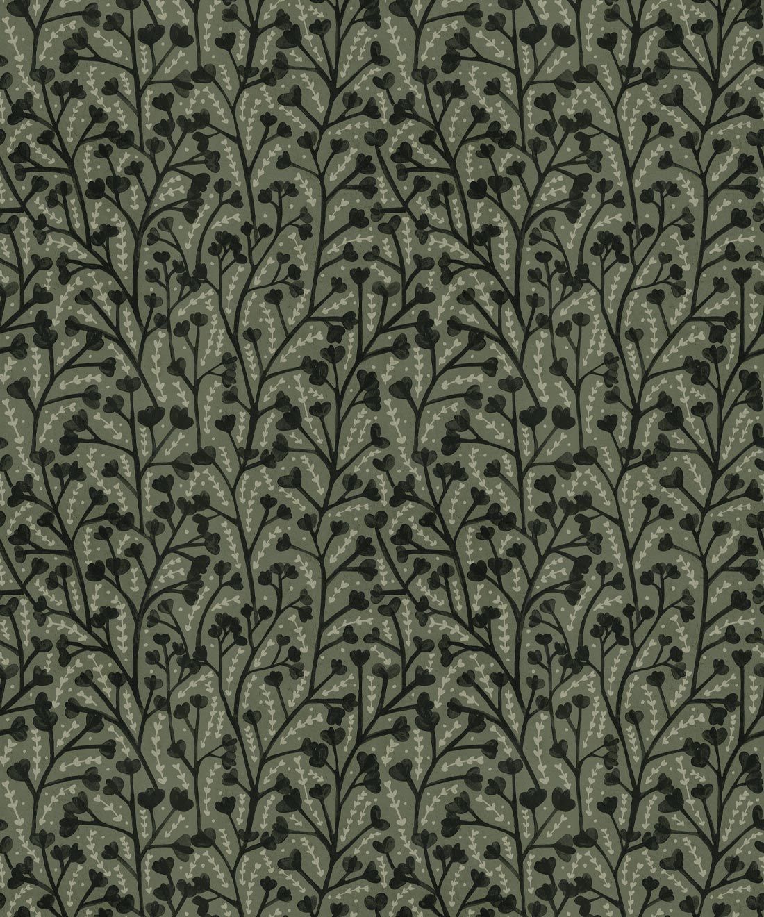
Image above of the Brush Wallpaper in the Sage colorway

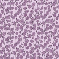
Image above of the Lunaria Wallpaper in the Blue colorway
M&K: Your artworks are all connected by their nature-inspired content, and feature a very distinct traditional and vintage style that’s unique to you as an artist. How and when did you discover your particular style?
KO: I think my style is still evolving. Nature just happens to be the most inspiring to me, so I constantly turn to photos that I have taken or images that stick in my subconscious. I love texture in my work and that makes for the more vintage, traditional look.
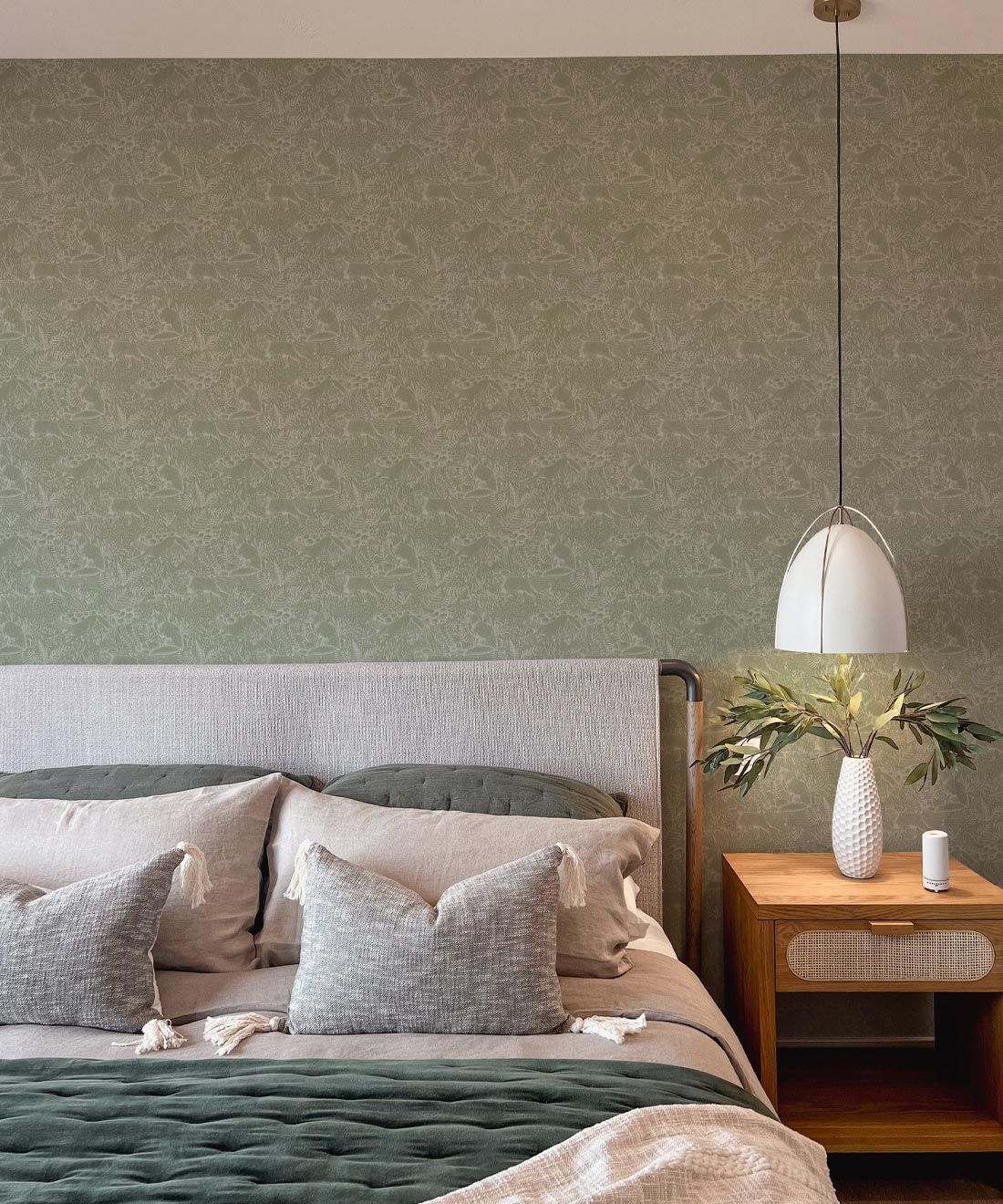
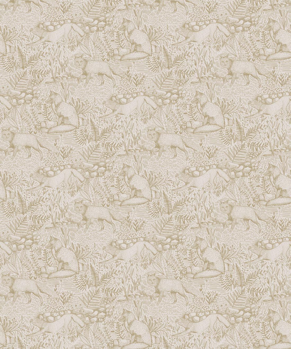
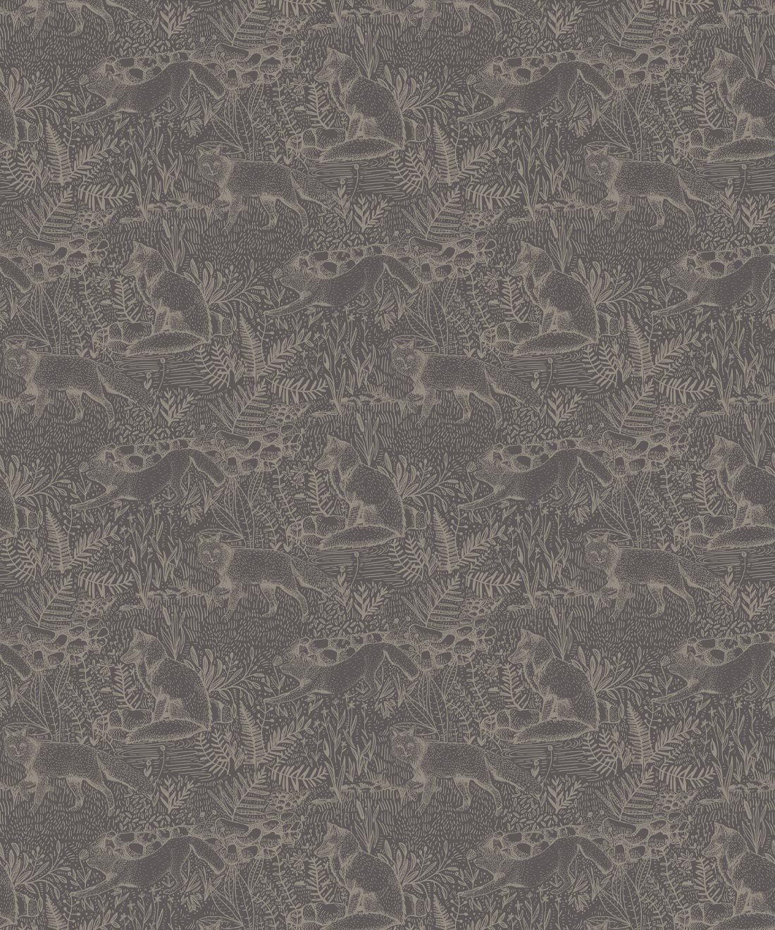
Image above of the Fox Wallpaper in the Sage colorway
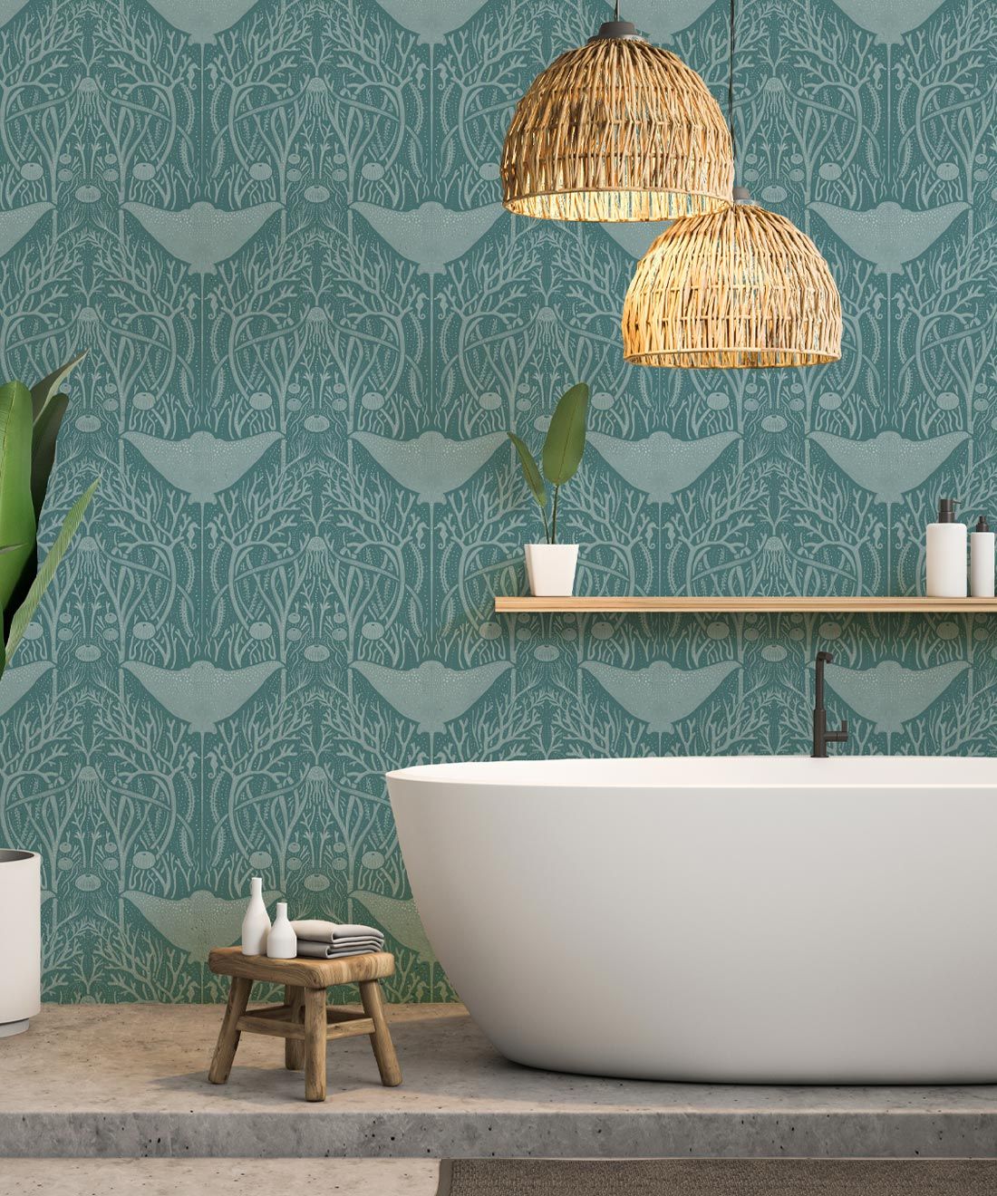
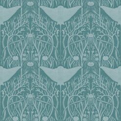
Image above of the Manta Ray Wallpaper in the Teal colorway
M&K: Surface designs are a huge component of your portfolio, but you also create gorgeous, detailed illustrations and dabble in the logo and web design world. You obviously have experience with a vast variety of mediums, but is there one that you always fall back to when creating new artwork? Or are you drawn to particular mediums for specific designs?
KO: Currently, I am particularly drawn to using my iPad to work with. It is the fastest and most satisfying way to see my ideas come to life. Sometimes, I just draw a lot of ideas, only to delete them. It is like a warmup to the design that I settle into and flesh out. I love to work in tons of details while other times, I just want to look at big chunks of color. What I end up putting out into the world is nothing like how it started.
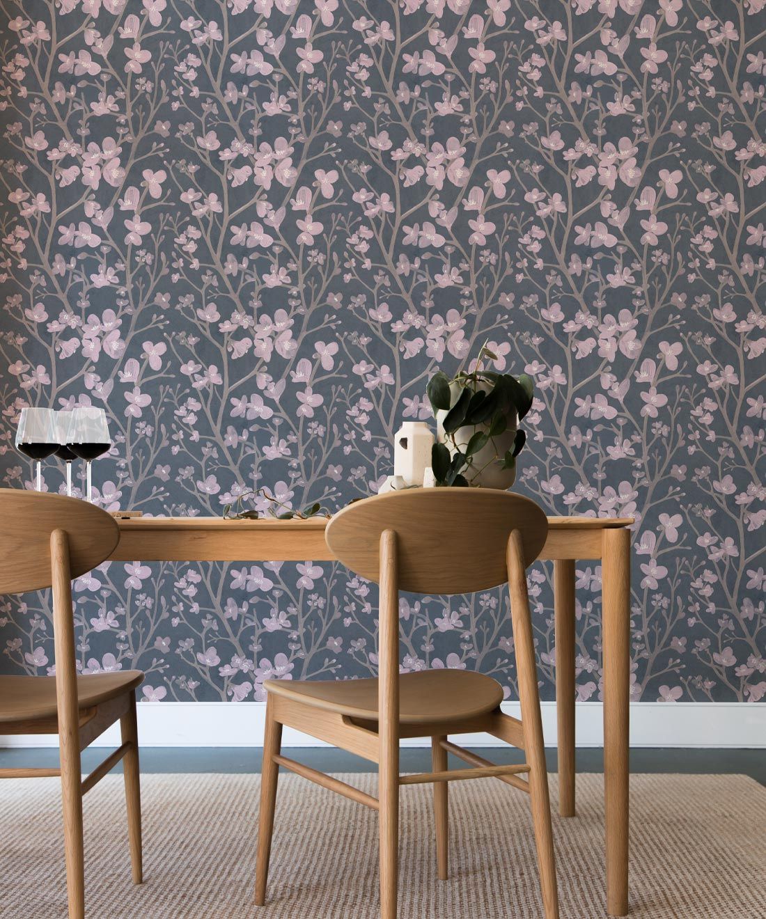
Image above of the Quince Wallpaper in the Gray colorway
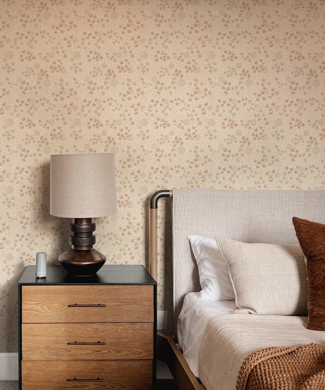
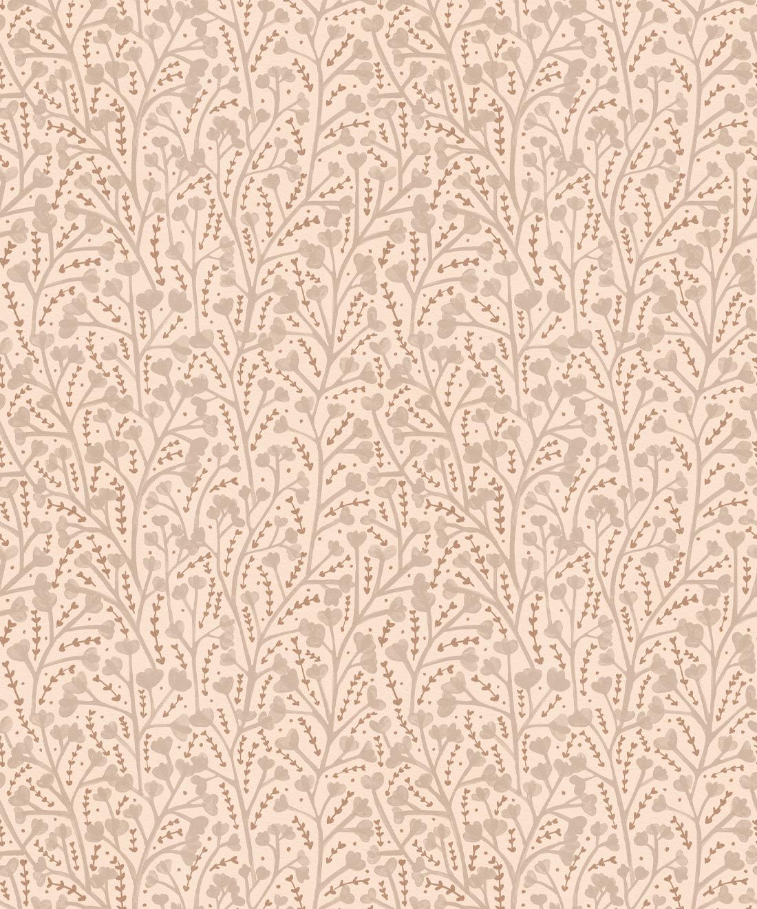
Image above of the Dainty Wallpaper in the Linen colorway
KO: Obviously, William Morris is a huge inspiration of my work. I get so fired up when I see his designs and want to sit down right then to work on new ideas. Music is also a huge component of how I find inspiration. Mostly moody, atmospheric music. When I am out on walks, I always find a ton of inspiration and make sure to take a lot of photos of the things that grab my attention. I also love to keep up with what others in my same field are doing and to see how their work is evolving and growing. Being in a community of like-minded individuals is very inspiring.
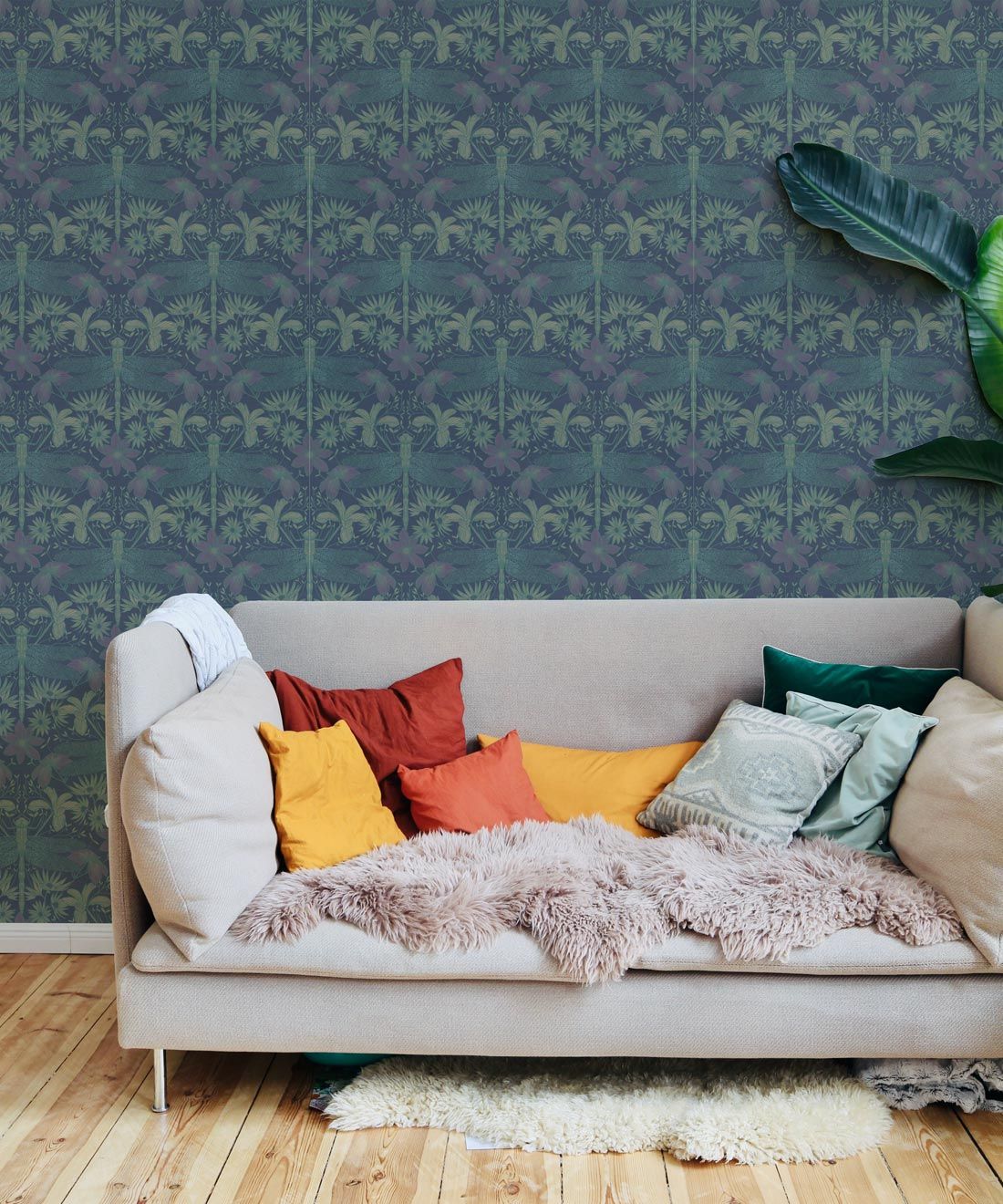
Image above of the Starseed Wallpaper in the Vintage colorway
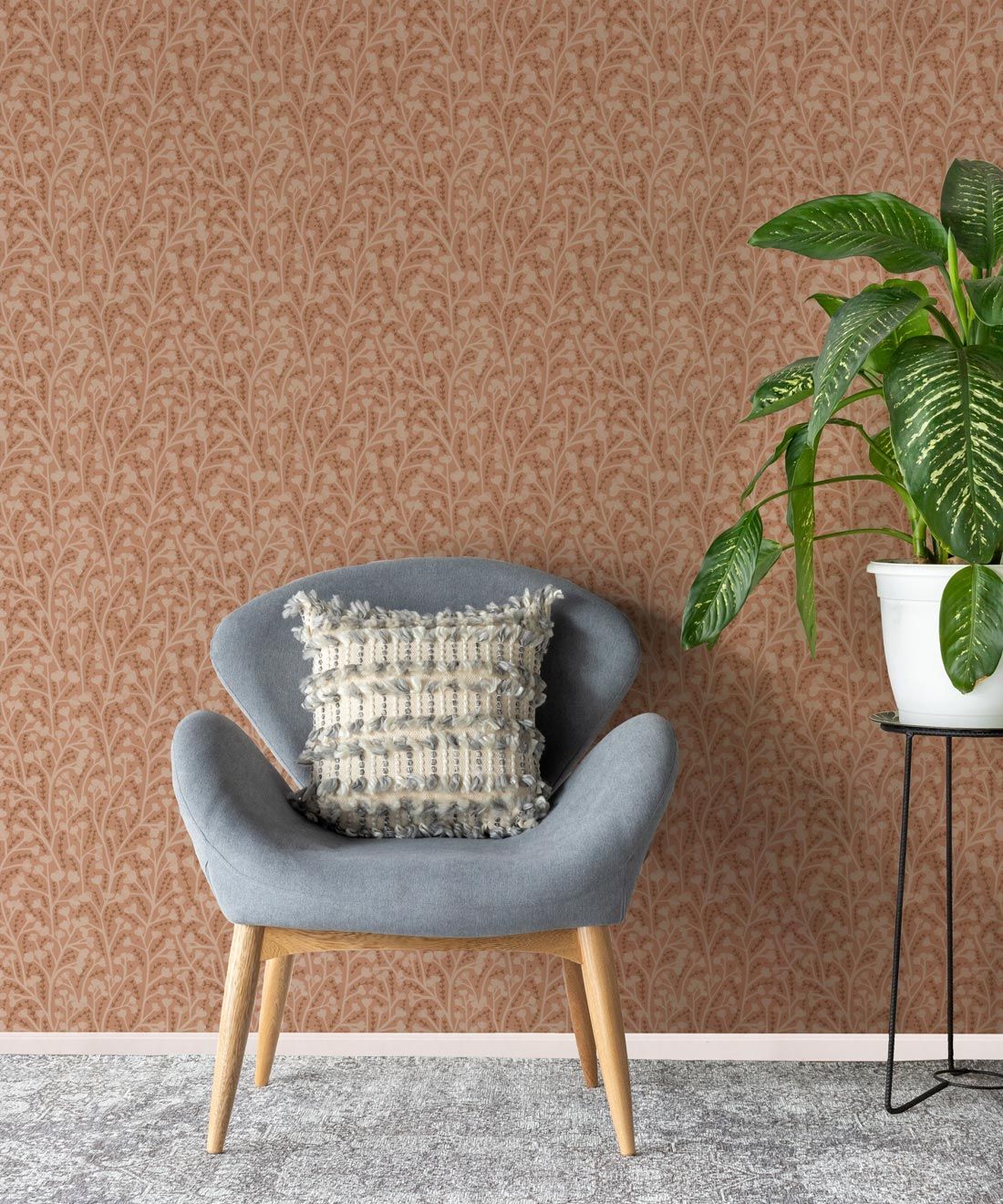
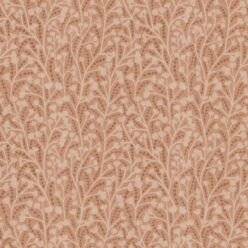
Image above of the Petals Wallpaper in the Terracotta colorway
M&K: Let’s talk color. Your designs are inspired by nature to some extent, so we obviously see that reflected in the colors you choose, but how do you settle on a particular palette for a design? What’s your process for when you have to narrow it down to a few select choices?
KO: I would say my choice of colors are heavily influenced by the mood I am in. I go through color phases and work with particular colors until I get enough of them and then move on. Sometimes it is light and neutral while other times it is heavy or more saturated. When it comes to designing for interiors though, I have to be practical and think about what the consumer might want for their home.
M&K: How do you feel about your artwork being turned into wallpaper? Have you ever worked with wallpaper before? Is the launch of your collection with M&K something you’ve been working towards for some time, or was it a spontaneous decision?
KO: I am totally excited to see my work as wallpaper. From the very start of learning about surface pattern design, I instantly wanted wallpaper to be the final product for my designs. Milton & King is the first wallpaper company I have licensed with, and I couldn’t be happier!
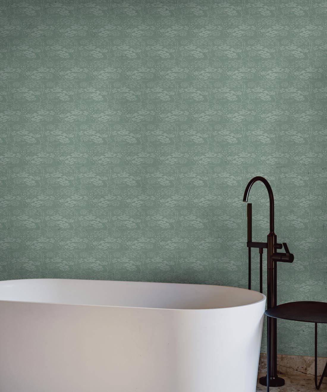
Image above of the Shoal Wallpaper in the Mint colorway
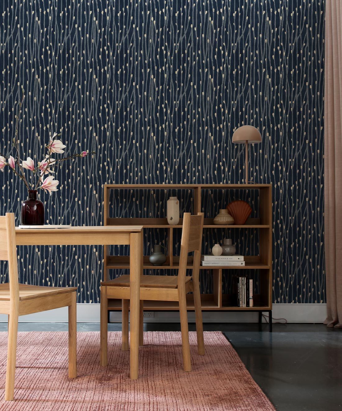
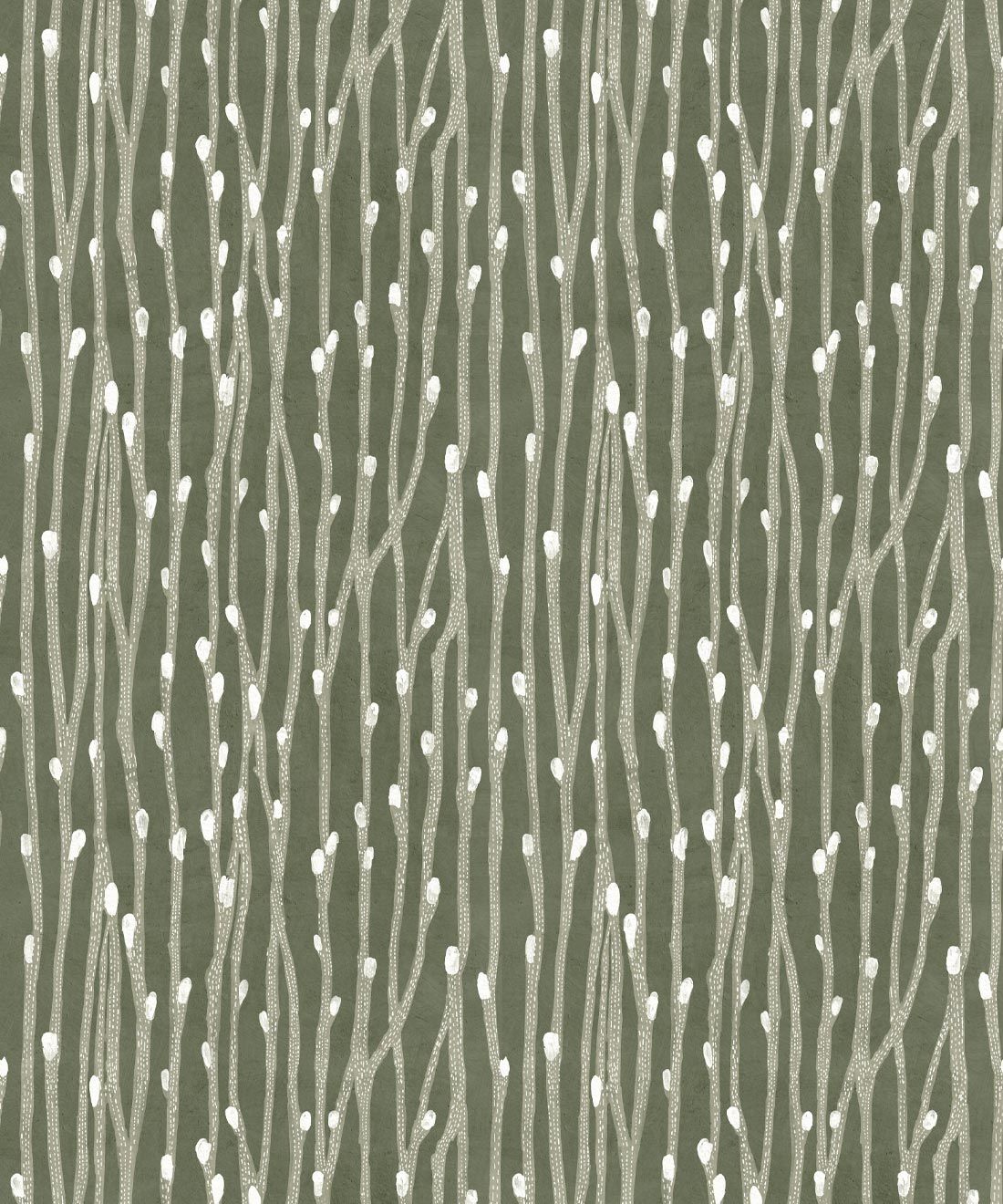
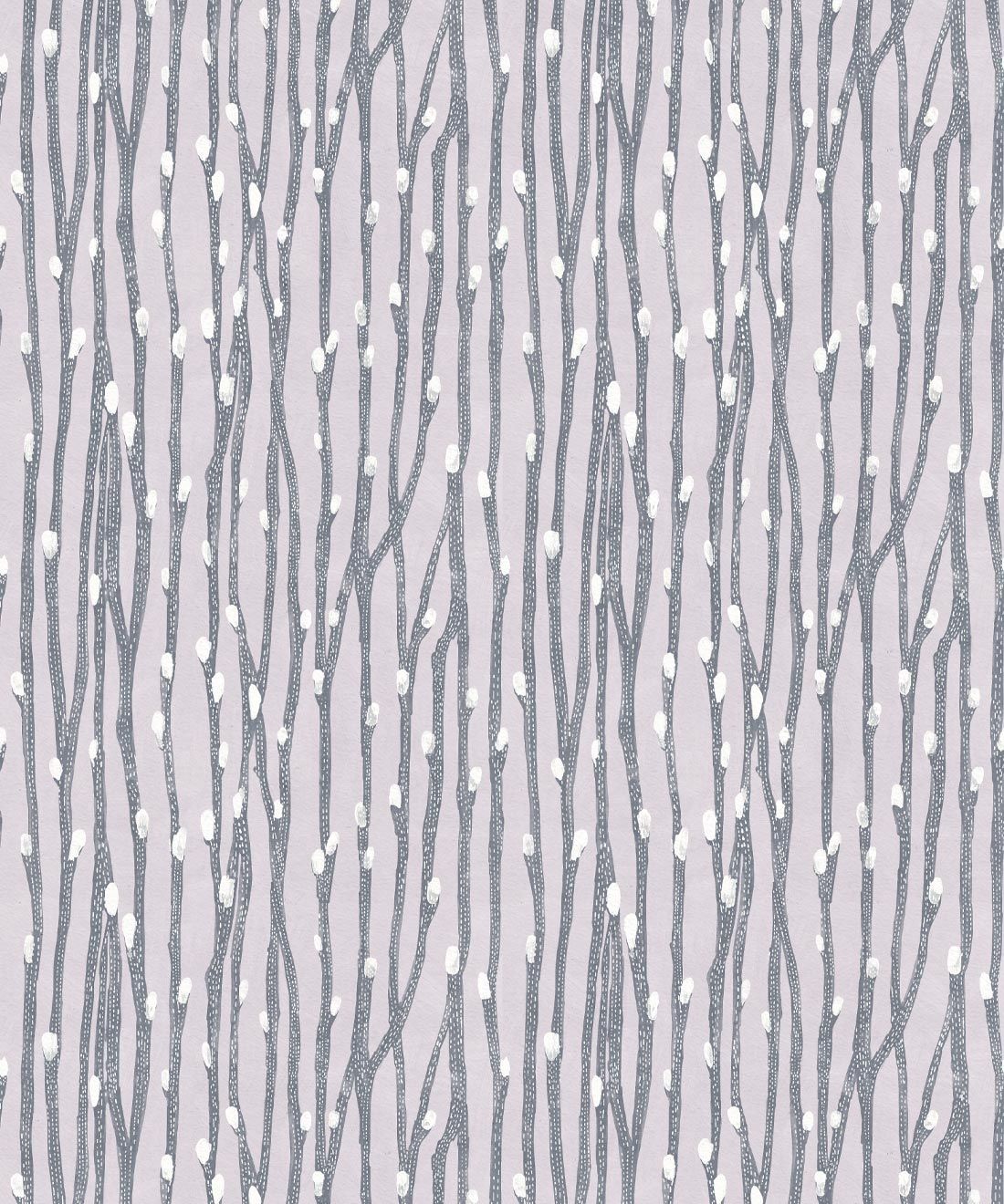
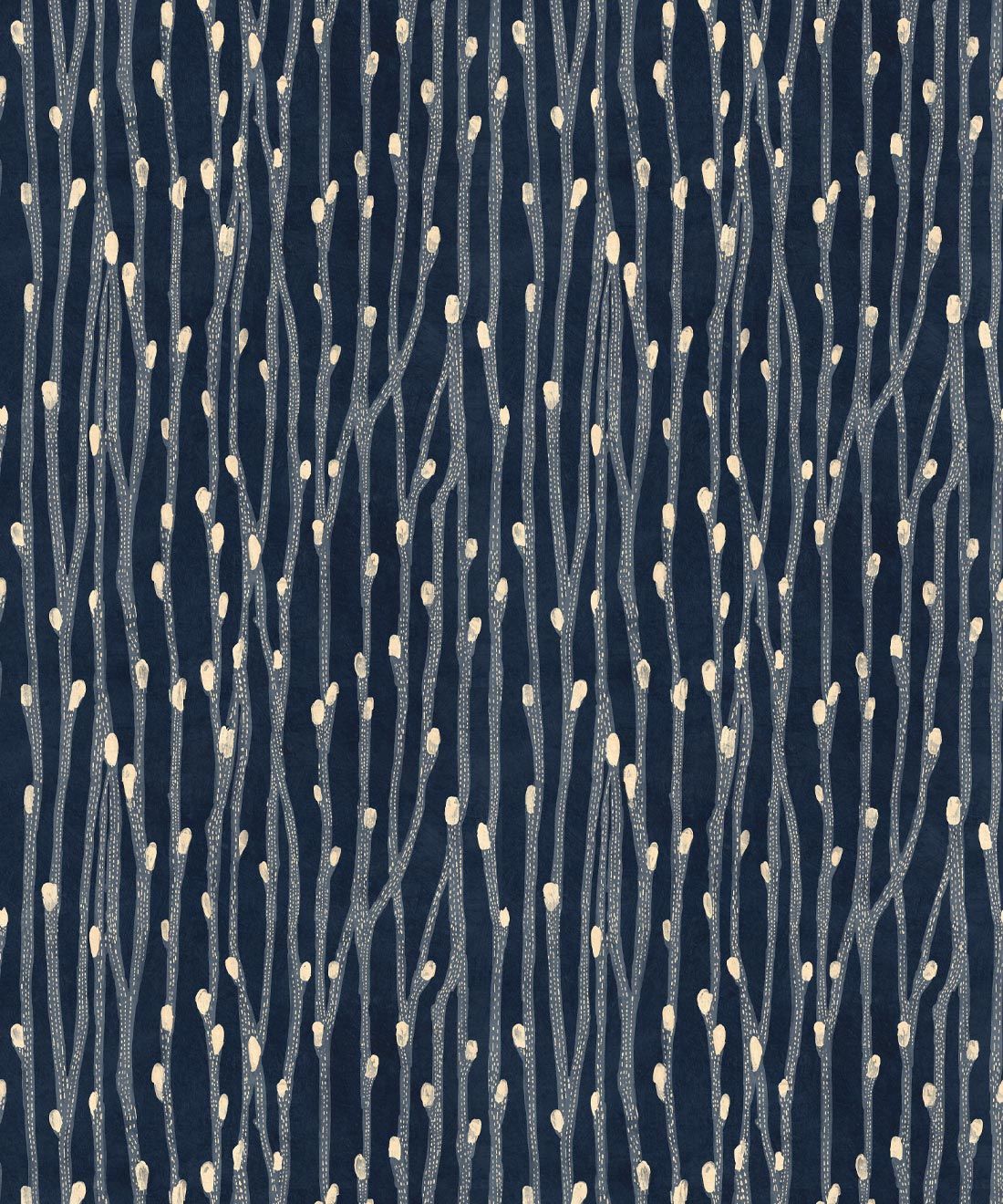
Image above of the Pussy Willow Wallpaper in the Indigo colorway
M&K: Of the collection you’ve launched with us, do you have a favorite design? Are there any designs that stand out to you, that really speak to you as an artist and a creator?
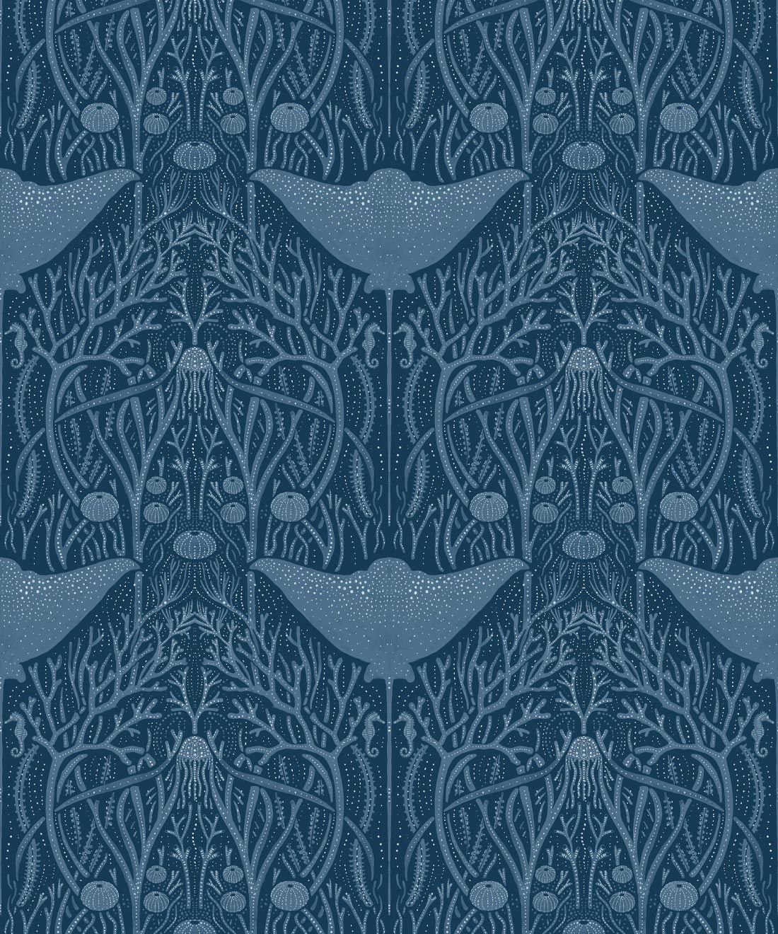
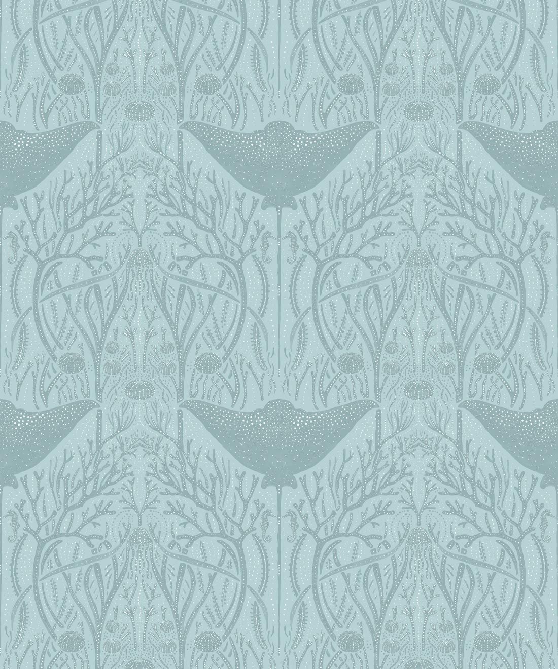
KO: I would have to say that Deep Sea is a pattern which feels unique, and a lot of people have gravitated towards. I love that design because it flowed so easily when I came up with the concept. It is versatile as a wallpaper and as a fabric and it works in many different colorways.
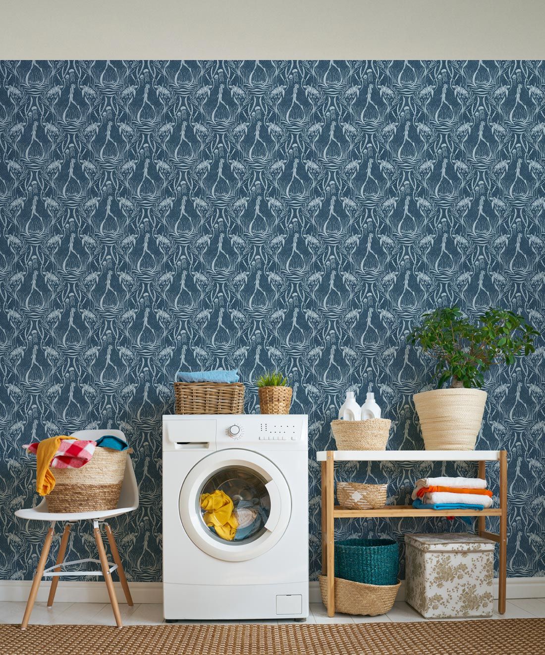
Image above of the Deep Sea Wallpaper in the Blue colorway
M&K: What’s next for Katie O’Shea, personally, professionally and artistically?
KO: I love to create patterns and the more the better! Currently I am working with a home decor and women’s clothing brand as an in-house designer. I hope to learn as much as I can and hone in on what it is that Katie O’Shea Design will be as a brand going forward.
